Work samples
-
 Off The Grid / On The Astral Plane
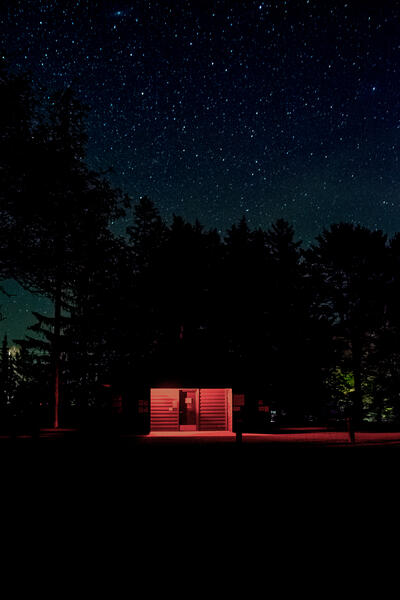
This long exposure photograph was shot in North West Pennsylvania at an event known as The Black Forest Star Party. Astro-Photographers and Astronomers a-like head to one of the least light polluted areas on the east coast for a weekend of star gazing. While mostly everyone was looking up, I wanted to look around. I came across this moment, and it made me think of all the silence around me. While there were thousands of people in attendance, there were many pockets of peace and solitude and an overall quiet atmosphere. It served as a therapeutic moment to reminisce on.
Photographed in 2021. Digital Photograph.
Available for PurchaseFor purchase information, please contact Sean - [email protected] . Thank you!
-
 The Rose
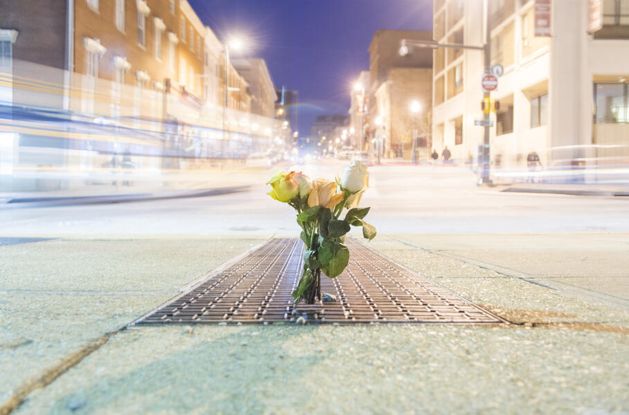
"The Rose" is inspired by Tupac Shakur's "The Rose That Grew From The Concrete" . On Valentine's day in 2016, I rushed to gather as many different colored roses I could that were available. I remember one of the florist's saying, "she must be very special." I smiled and replied back, "these roses are for everyone." Once I found the composition that was going to work best to realize the concept, I made several exposures. I created a composite of the various light trails happening around the bouquet, to give a full feeling to the middle and center of the composition. An interesting moment of light refraction, in the top left, it looks like an error with the building looking misaligned. This phenomena happened when a city bus passed by, and the way it's shape bounced light in respect to that building created that effect on the exposure. May we all receive our roses while we can still smell them, and in the words of the late, great, Mr. Shakur - "Long Live The Rose That Grew From The Concrete".
Available for PurchaseTo purchase, please contact Sean at [email protected] . Thank you!
-
 Letting Loose
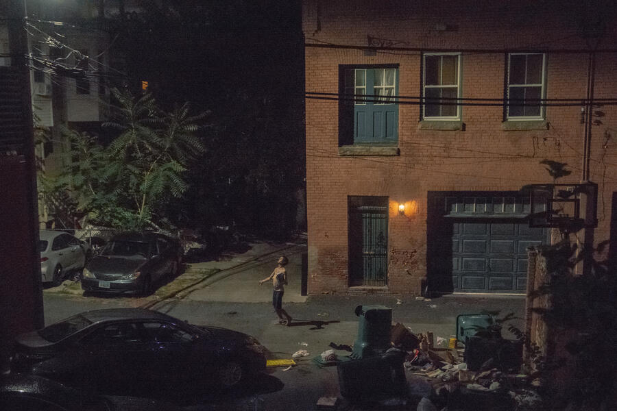
Around 2am one night I heard some rustling out in the back alley. At first, I paid it no mind because sometimes that’s just the sound of city living. This rustling went on for more than a few minutes, became much louder, and was being accompanied by a voice.
I watched from my window as this person was fighting a battle. It could be from needing a fix and going through withdrawal, it could be voices and thoughts plaguing their mind, it could be both, it could be neither.
As I watched them going through this episode, I did question whether or not to pick up a camera. I thought about particular photos in the history of photography that were controversial. I also thought about how those photos started or added to important conversations about society.
I watched the swells and emotional rollercoaster this person was experiencing. With each bottle broken or item thrown they fought to find peace. They were not being destructive to property, this was all trash, and my car was closest to them while they fought how they felt. I have car insurance, I wasn’t worried about that. This person was fighting for their life.
As they began to get worn out, at one point they were crotched down, sobbing heavily, they looked up at the street light and that’s when this photo happened. It may be God, divinity, energy, whatever you want to call the moment of salvation I watched them experience. All I know, in that very moment, they beat whatever they were fighting against.September, 2021. Digital Photograph.
-
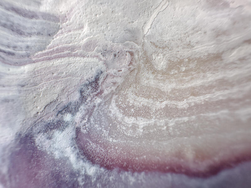 Abstract Realities - Ripples
Most of my work to date exists in the Realism genre. I'm not one that likes to be boxed in, deciding that I needed to experiment with more abstract and surreal ideas. I started the project Abstract Realities to take natural elements found on earth, and create abstract viewpoints with them. This is a macro photo of a seashell.
2025. Shot on iPhone.
Available for PurchaseFor purchasing information please contact Sean - [email protected]
About Sean

I see the world and fathom existence in ways that can be incomprehensible. My father didn’t want me. I forgave him, because I knew the universe did.
The universe needed my eyes to show people how they should be seen, how the world should be viewed. The universe needed my words to translate thoughts and emotions in ways that others can feel confirmed of their own. The universe needed my energy so that the weight of reality could be hoisted up and balanced. The universe needed my mind… more
Wockenfuss Candies - Art Direction, Brand Identity, Styling, Still & Motion Photography
This is an overview of work I've done with Wockenfuss Candies over the last five years. What began as a project to update their product photography and brand identity, has become a multi-media approach that has translated from social to physical space. It's been a pleasure to work with a brand that not only is Baltimore based, it is a legacy brand that serving the community for over 100 years. To know that I've contributed to the success of seeing a well storied brand get a refresh to help keep their momentum going is satisfying in ways that only their delicious candies could match.
-
Wockenfuss Candies - Mechanical Gift Wrap Machine
Overview of the mechanical gift wrap machine for Wockenfuss Candie's pre-wrapped assortments for the Holidays.
-
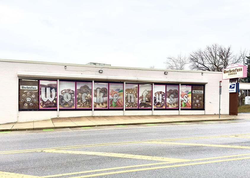 Wockenfuss Candies - Factory Store Photo Wrap
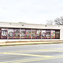
Based off of the refreshed identity I helped to create, Wockenfuss Candies factory store on Harford Rd now has a wrap of my photography on it's street facing side. I was not responsible for the design of the wrap, just the photography.
-
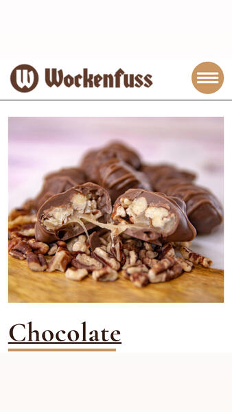 Wockenfuss Candies - Product Photography
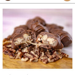
I've been working with Wockenfuss Candies for about 4 years now. I had met them through a project I was doing for a third party, and one of the owner, Jen, had mentioned she wanted to refresh the product photography. I created a proposal that included integrating the colors of the brand into the photography, while maintaining a proper aesthetic that could translate well into different forms of communication. I proposed the idea of creating a painted canvas look, and using wood and marble textures to accent the style. This would create an eye-catching aesthetic that would help to reinforce the brands colors. We've been working with that idea ever since. It has translated to their social media, website, marketing collateral and most recently new labels for pre-packaged assortments and a new store wrap for their factory store location.
-
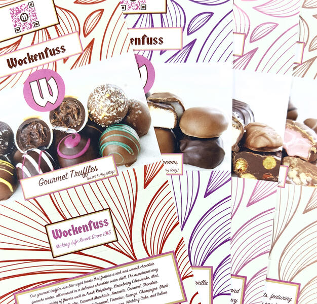 Wockenfuss Candies - Pre-Packaged Labels
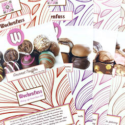
A recent addition to the portfolio for Wockenfuss Candies. It had been discussed that they wished to change the labels to something that was more photo-heavy, and allowed space on the sides for the physical product to be seen. I had made a couple mock-ups of design ideas, and based on those, the project was green-lit. I created primarily a new set of photography for these products, knowing that there was going to be particular design hardpoints when it came to the label dimensions. Utilizing the brand identity from the product photography and adding some design elements that helped to reinforce the brand as a premium legacy company, the results turned out great. The color coding was carried over from the original packaging, because the colors are used for replenishment orders when more items are needed at their store and distribution levels.
Pappas Seafood Co. - Art Direction, Brand Identity, Styling, Still & Motion Photography
I was contacted by Pappas Seafood Co to photograph their menu to use for marketing collateral, menus, and digital usage for website, social, and delivery apps. For this project, I sourced all materials being used for staging, and handled all the food styling for each plate as well.
They were so happy with the results, I came back to film a commercial for them. Based off of the identity that was created from the stills, that served as the foundational element for the motion visual.
The identity has translated onto their social channels utilizing the same tabletop items that are included in the stills and motion visuals.
-
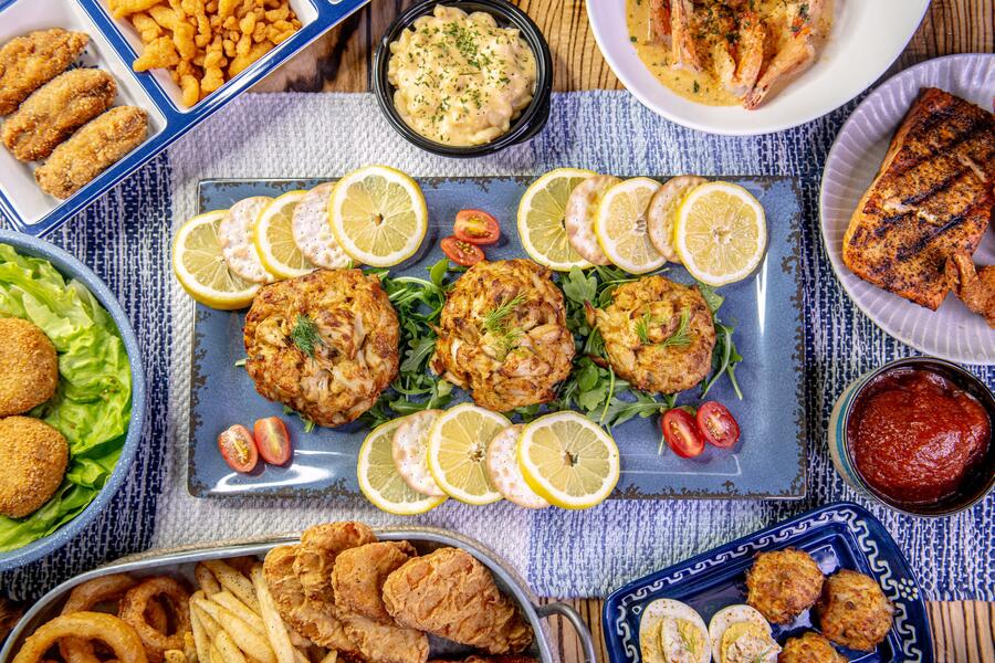 Pappas Seafood - Dinner Spread
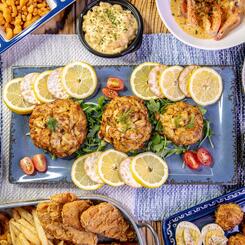
Overhead photo of a dinner spread for Pappas Seafood Co. This shows a prominent display of the different tabletop items used, and the overall styling.
-
Pappas Seafood Co. - From Our Family To Yours
Pappas Seafood Co was so pleased by the stills we created together, they asked if I would shoot a commercial for their shipping and distribution center. The concept of the video was to show the capabilities of how and where they can ship, and that the recipes have stood the test of time.
-
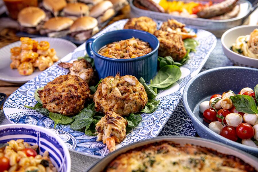 Pappas Seafood Co. Dinner Spread Photo #2
This is a second set up of a dinner spread for the stills. We wanted to show a few different dinner spread set ups to incorporate as many different dishes as possible.

