-
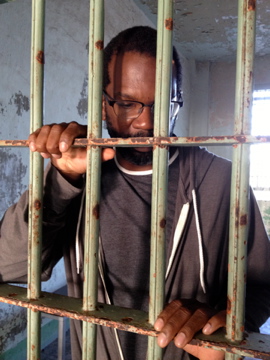
 Alcatraz ResidencyI've performed and lectured in prisons across the country. Due to restrictions in those facilities, cameras or recording devices are not allowed. This shot is from Alcatraz during a residency with the We Players Theater Ensemble. Performances, lectures, visual art, and theater took place throughout the facility, and on the grounds.
 -
 Lecture/Performance on AlcatrazI’ve presented performances and visual art exhibitions across the country and have collaborated with educational institutions to address the issue of mass incarceration. Presentations have taken place in schools, active prisons and also inactive prisons such as Alcatraz.
 -
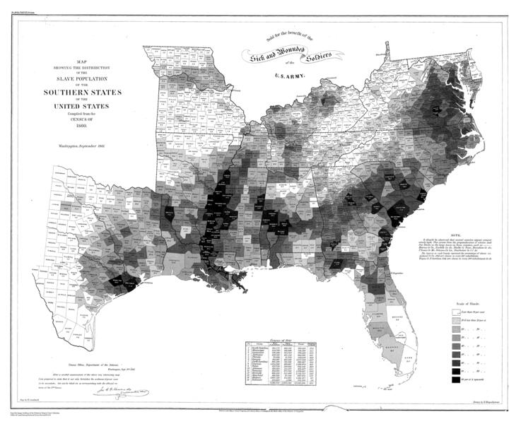 Slave Density Map (1860)Original Slave Density Map from 1860. This data is based on the 8th Census of the United States.
 -
Slave Density Map - 1860 CensusI'm currently animating this slave density map that shows the slave population in 1860. The highlighted red areas show slave density of areas with 50% or more. Along the Mississippi River, slave density was over 90% in many counties. The state of South Carolina and Mississippi had more slaves in the state than free. This data is based on the 8th Census of the United States that took place in 1860.
-
 Constitution Day: Bars and Stripes Forever: Inequalities and Incarceration in AmericaConstitution Day: Bars and Stripes Forever: Inequalities and Incarceration in America Maryland Institute College of Art Panel discussion featuring: Baltimore-based author, journalist, and television writer/producer David Simon, Moderated by WYPR’s The Signal producer Aaron Henkin, social innovator Susan Burton, who has dedicated her life to helping formerly incarcerated women re-enter society, and artist and activist Ashley Hunt, who uses video, photography, mapping, and writing to engage social movements and investigate the prison system. PROLIFERATION was featured at the beginning of the panel discussion.
 -
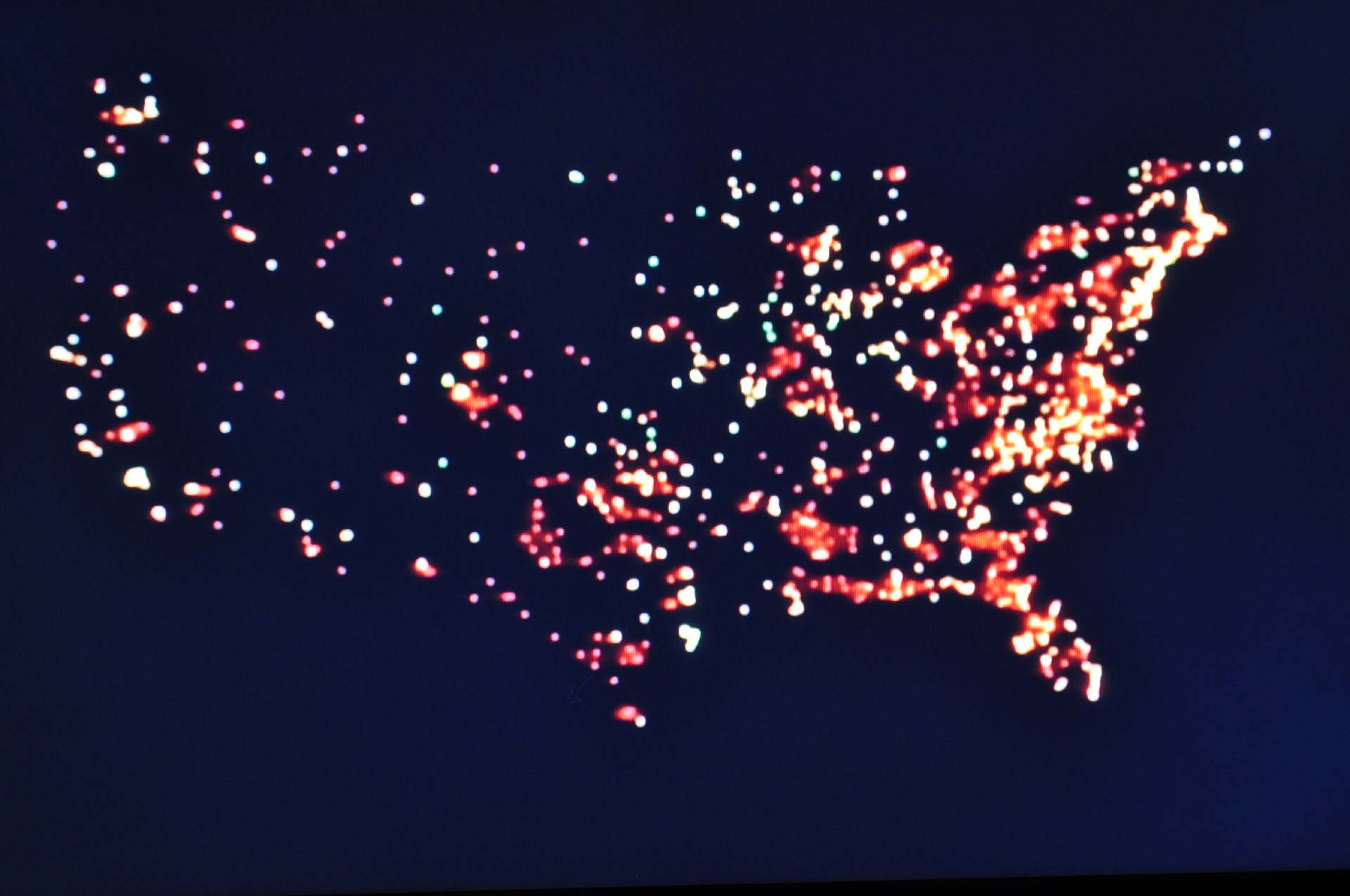
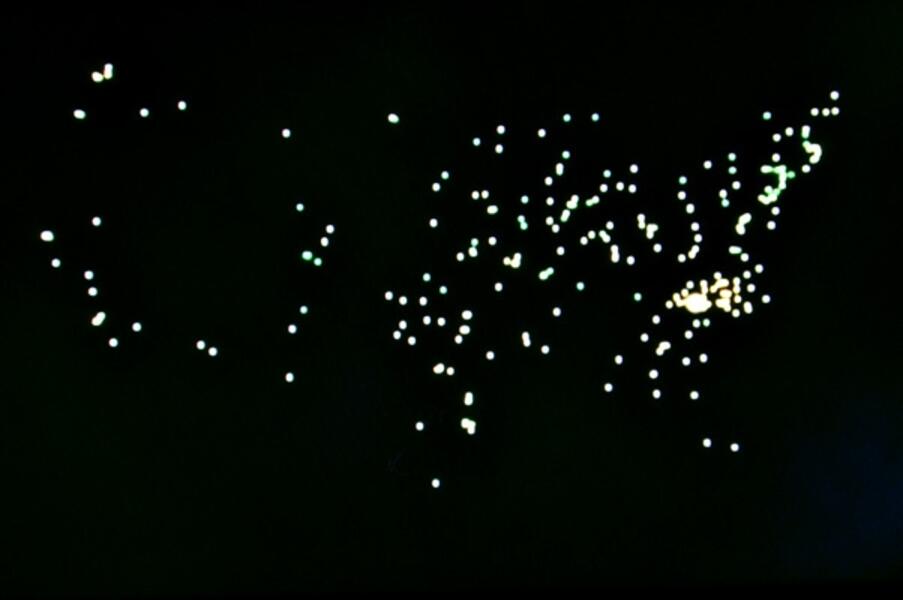
 PROLIFERATION - Animation StillThis is a screen shot from PROLIFERATION. Near the end of the video. Timeline: Green Dots: 1778-1900 Yellow Dots: 1901-1940 Orange Dots: 1941-1980 Red Dots: 1981-2005
 -
 PROLIFERATION - Animation StillThis is a screen shot from PROLIFERATION. Green Dots: 1778-1900 Yellow Dots: 1901-1940
 -
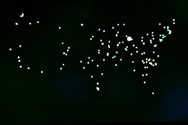
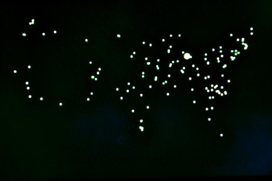 PROLIFERATION - Animation StillThis is a screen shot from the first few minutes of PROLIFERATION. The green dots are prisons built before 1900.
 -
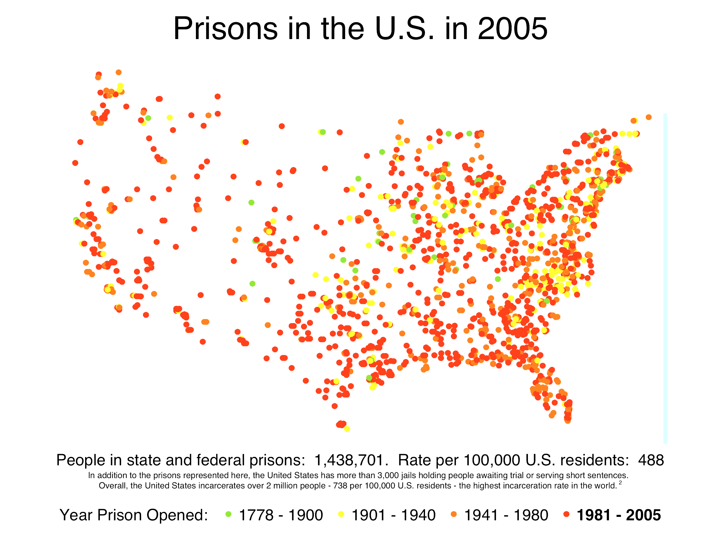
 Prisoners of the Census Data - 2005This research was done by Rose Heyer of Prison Policy Initiative. This information was used to create the data visualization piece PROLIFERATION. When creating art work you hope will be influential to change, or a catalyst for conversation, it's important to use accurate information.
 -
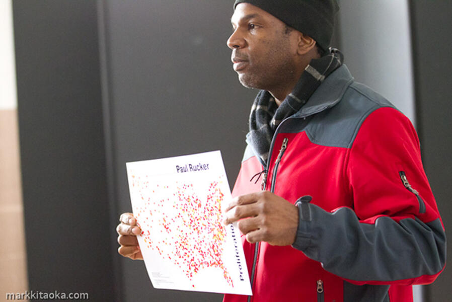
PROLIFERATIONVideo animation of the growth of the US prison system set to music. Art can tell stories. For years I would talk about injustice by reciting numbers and statistics. When you say, “We have over 2.3 million people in prison,” it’s a large number to comprehend. Doing research at a prison issues-themed residency at the Blue Mountain Center in New York, I found some maps that I felt could help tell the story. This project shows the proliferation of the US prison system if seen from a celestial point of view. Using different colors to indicate different eras, the viewer can clearly see the astonishing growth of this system over time. Timeline: Green Dots: 1778-1900 Yellow Dots: 1901-1940 Orange Dots: 1941-1980 Red Dots: 1981-2005