About Steven
Carroll County
Steven Pearson is a Painter and an Associate Professor in the Art & Art History Department at McDaniel College in Westminster, MD where he has been teaching various art courses since 2004. He is also the Director of the college'?s Rice Gallery.
Steven was born in Johnstown, NY, and upon graduation from High School he served honorably in the United States Navy. He received his Bachelor of Science in Studio Art from the College of Saint Rose in Albany, NY, and his Master of Fine… more
Steven was born in Johnstown, NY, and upon graduation from High School he served honorably in the United States Navy. He received his Bachelor of Science in Studio Art from the College of Saint Rose in Albany, NY, and his Master of Fine… more
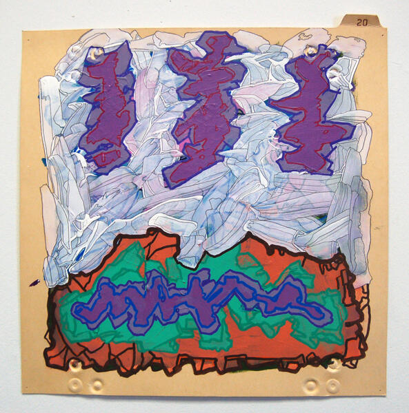
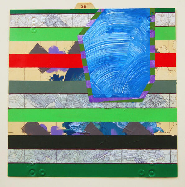
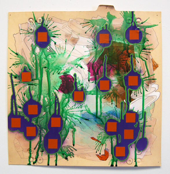
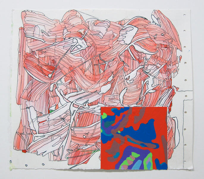
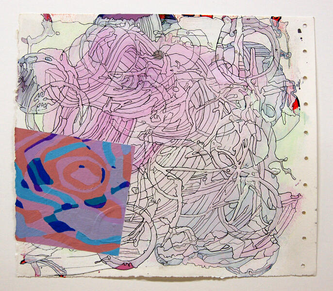
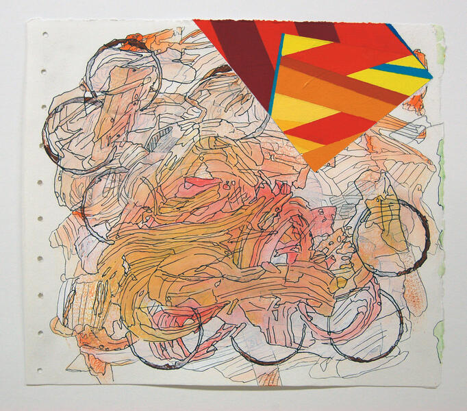
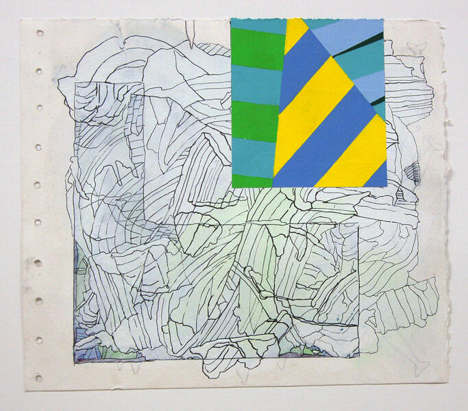
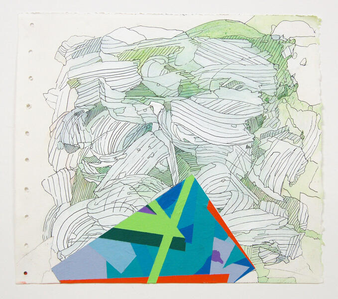
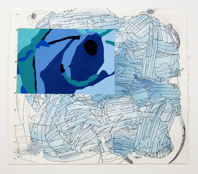
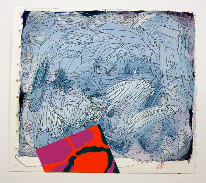
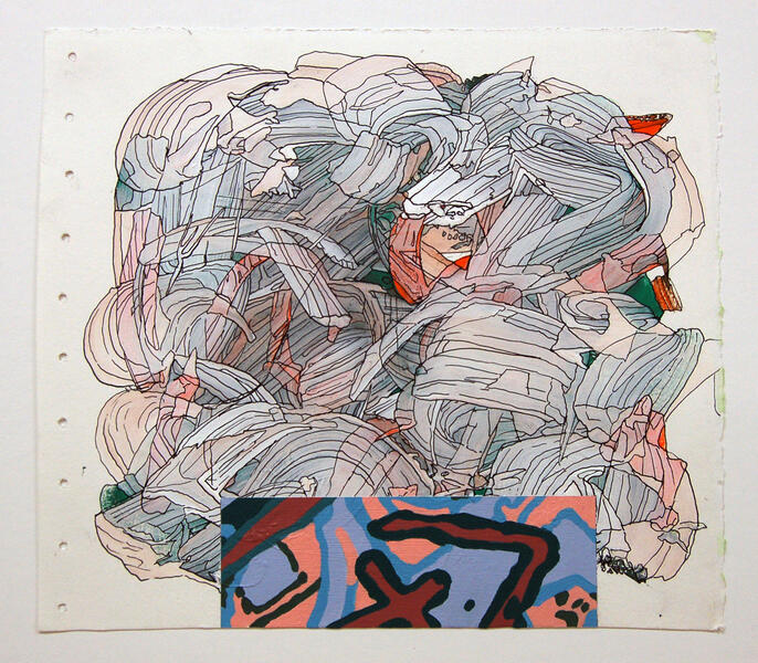
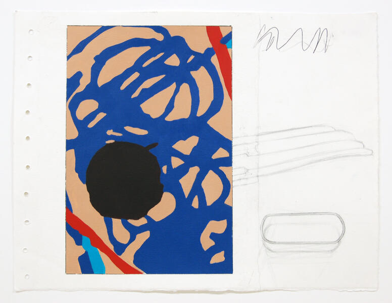
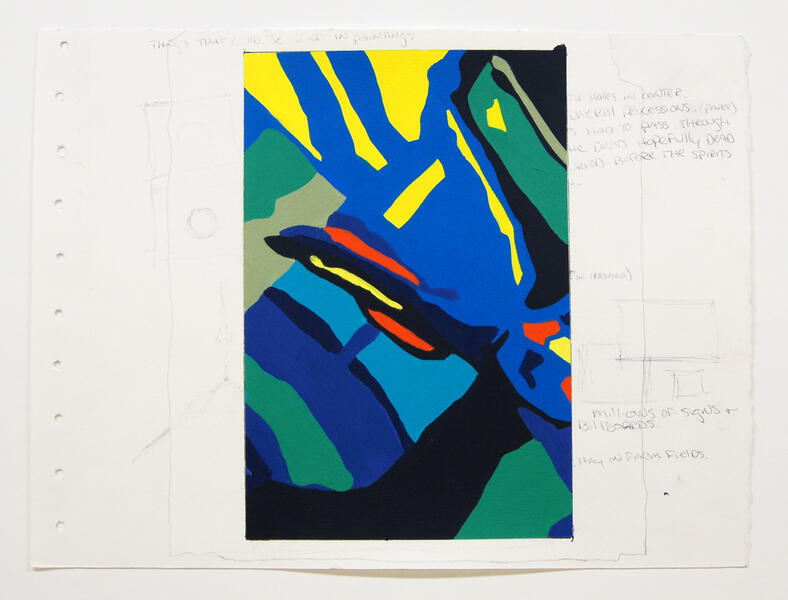
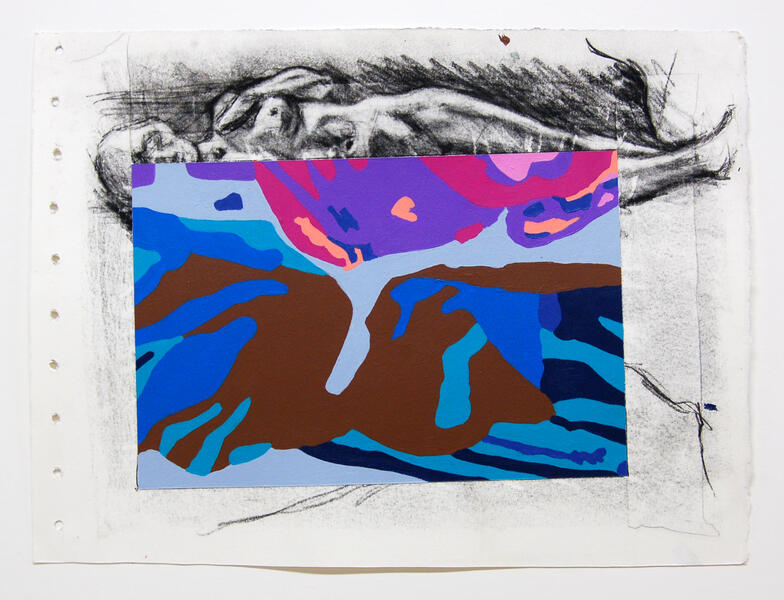
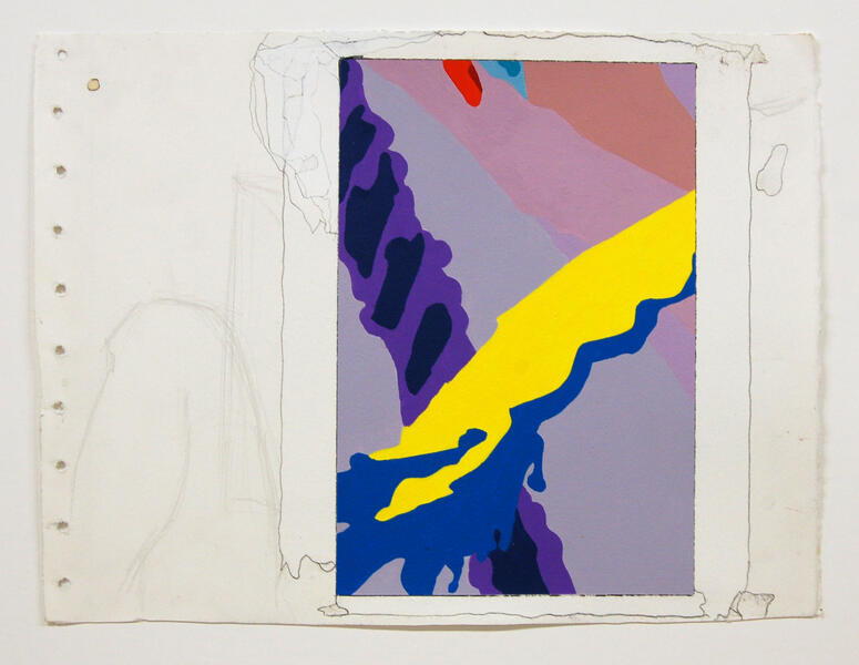
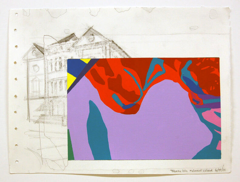
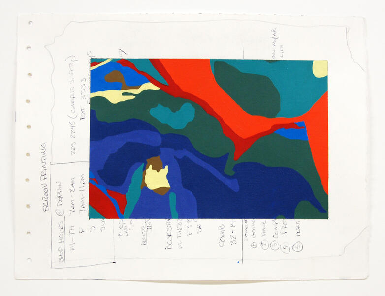
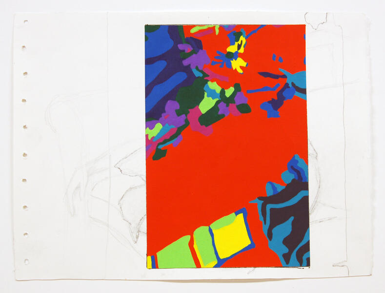
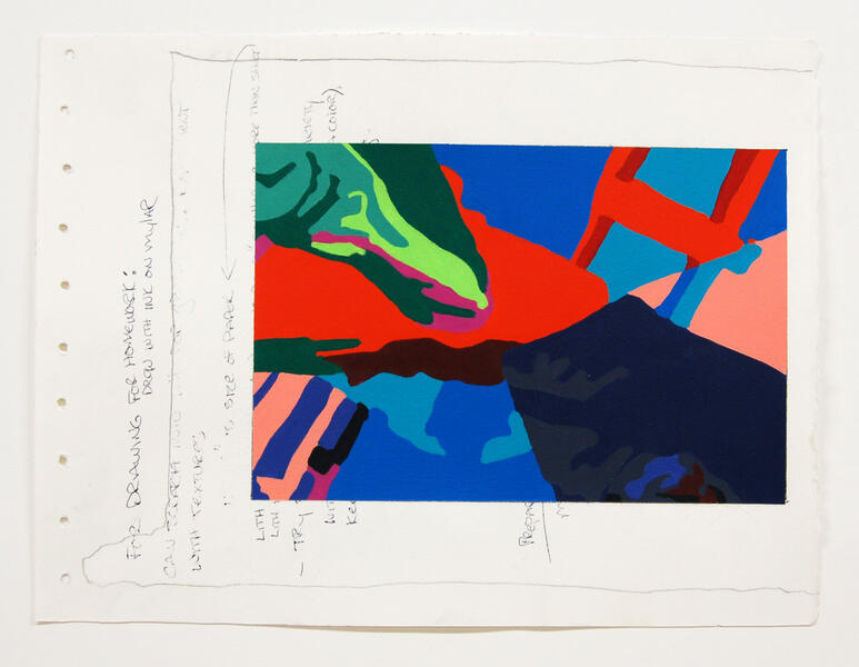
Visual Diaries
-
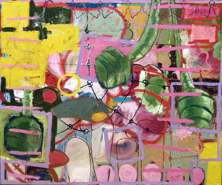
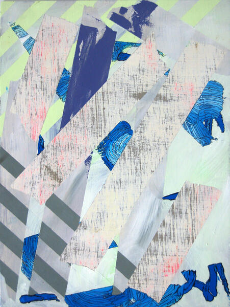
 Continuation2005 Oil on Canvas 72" x 96"
 -
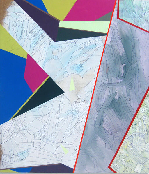
 On The Rise2006 Oil on Canvas 60" x 72"
 -
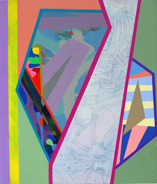
 Reconfigured2006 Oil on Canvas 72" x 60"
 -
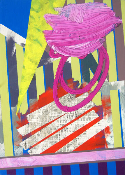
 Copulation2006 Oil on Canvas 60" x 72"
 -
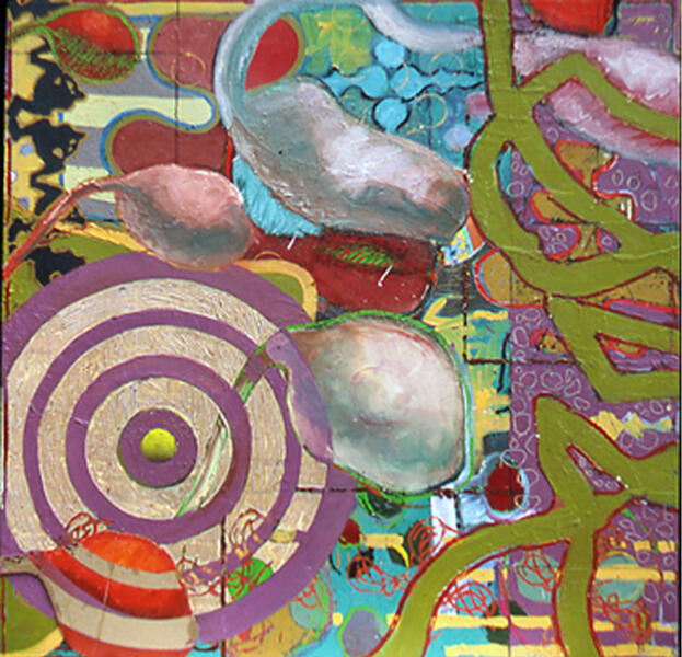 improbability2005 Oil on Panel 48" x 48"
 -
 This Started with 3 Boats, 2005Oil on Canvas 60" x 72"
 -
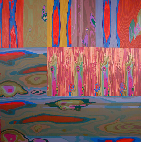
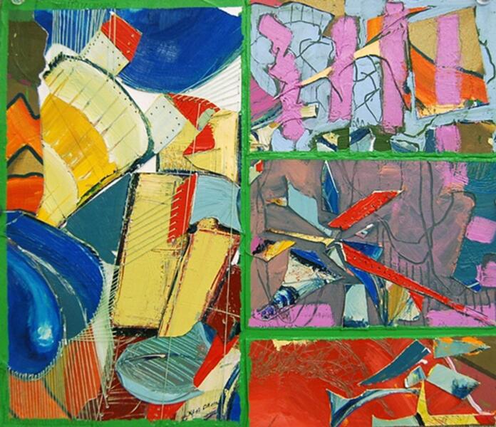
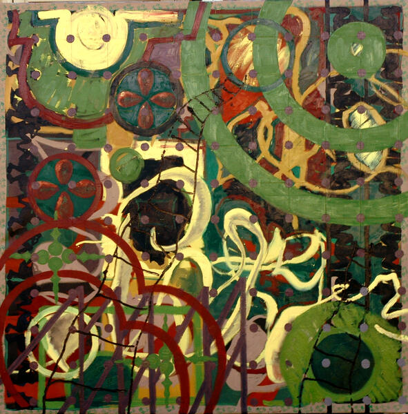 Change Precedes Progress2005 Oil on Canvas 68" x 68"
 -
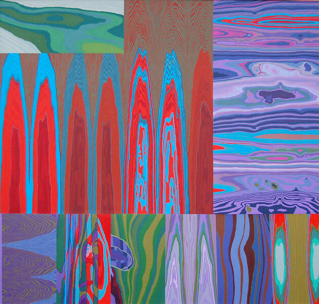
 Contained and Controlled2006 Oil on Canvas 76" x 90"
 -
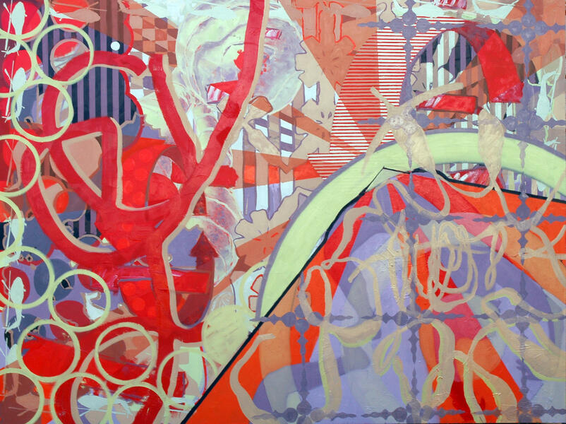
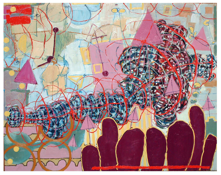
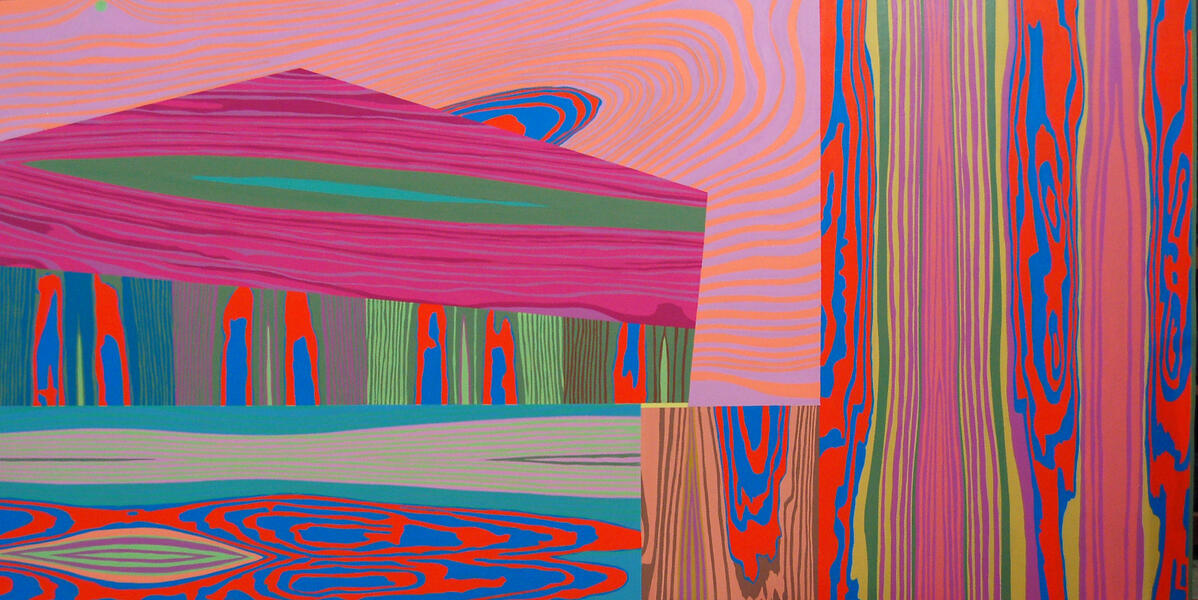
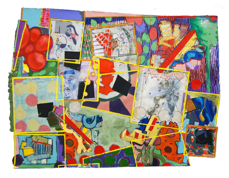
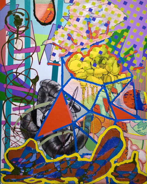
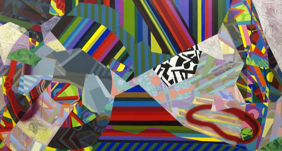
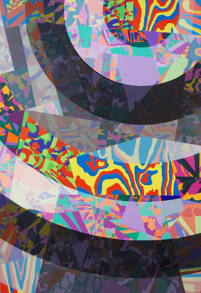
 (re)production2006 Oil on Canvas 70" x 180"
 -
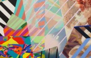
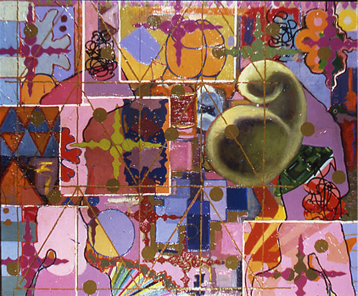
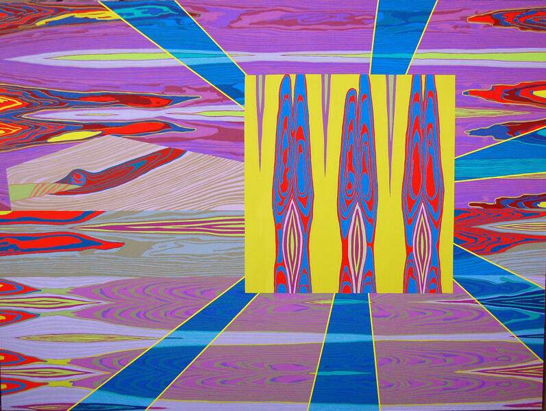
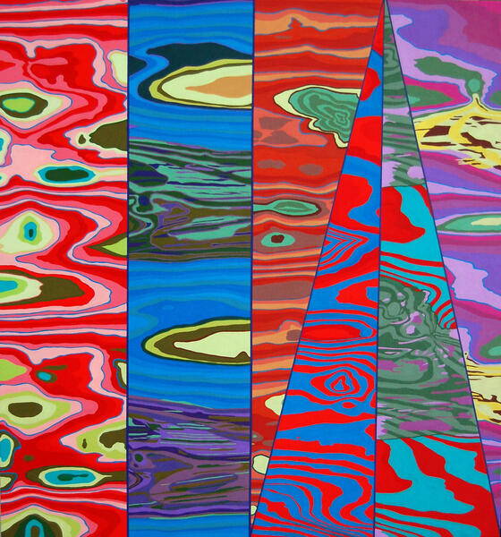
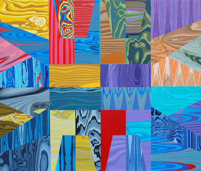
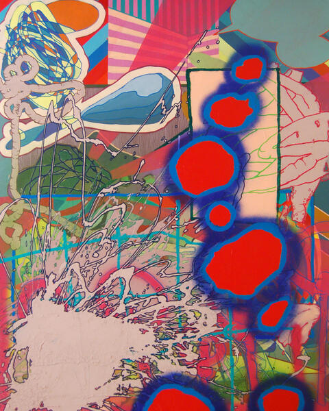
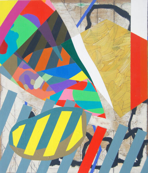
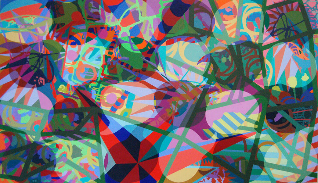
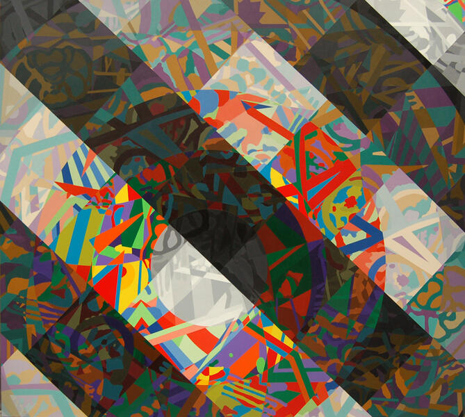
 Ut Pictura Scientia2005 Oil on Canvas 72" x 120"


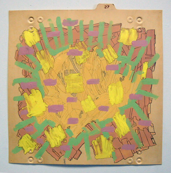
Heroes and Villains
-
 Constant Vigilance, 2008Acrylic on Birch 76" x 72"
 -
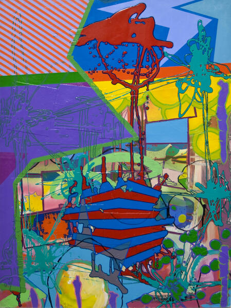
 The Enemy Chases Them To and Fro, but our Heroes Stand Proud, 2007Acrylic on Birch 72" x 96"
 -
 A Heroes Mo(u)rning, 2008Acrylic on Birch 35" x 60"
 -
 Some Heroes Step Forward, 2008Acrylic on Panel 68" x 72"
 -
 Though the Future Looks Bleak, Our Heroes Maintain their Steady March ForwardAcrylic on Birch 72" x 72"
 -
 Even Heroes Have Flaws, 2008Acrylic On Birch 48" x 45"
 -
 Searching For Resolution, 2008Acrylic on Birch 48" x 94"
 -
 Hero/Villain, 2008Acrylic on Birch 47" x 94"
 -
 Batman, Robin, Joker, Harlequin, 2008Acrylic on Birch 63" x 94"
 -
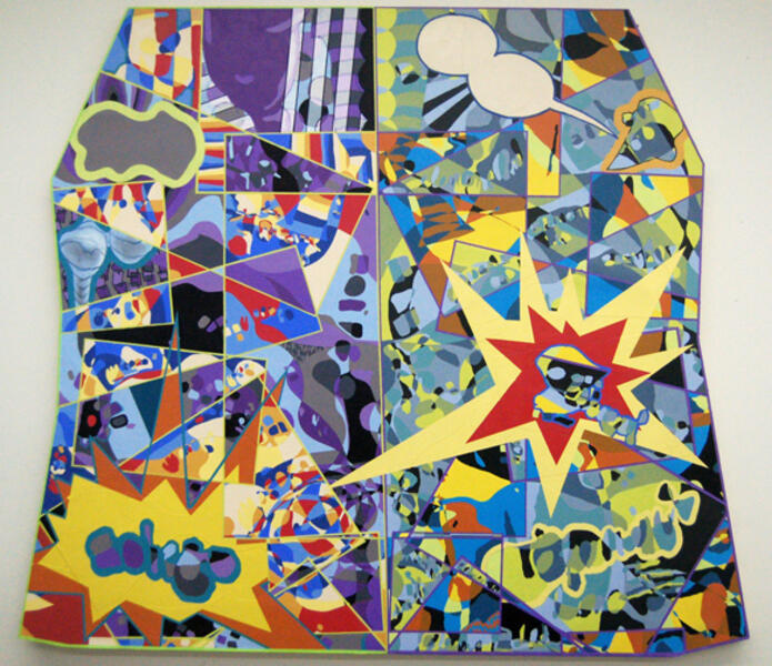
 Too Good, Too Evil. 2008Acrylic on Panel 79.5" X 94"


Dualities and Amalgamations
-
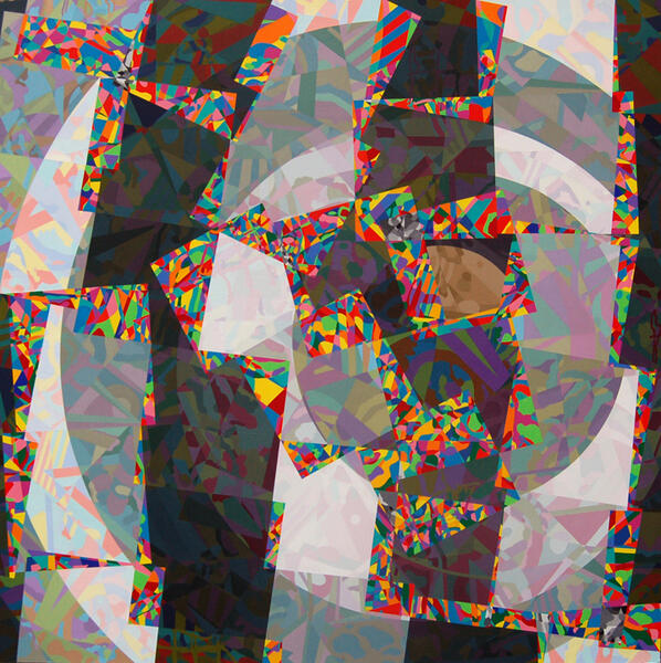
 what-was-once-powerful-ceases.jpg
 -
 j-steven_pearson.jpg
 -
 i-steven_pearson.jpg
 -
 Against Overwhelming Odds, 2009Acrylic, Spray Paint, Paint Pen on Paper Mounted on Panel 30" x 22.5"
 -
 Kabamm!!, 2009-2010Acrylic, Spray Paint, Paint Pen on Paper Mounted on Panel 39" x 31"
 -
 Stray Thoughts of Heroism, 2009Acrylic, Spray Paint, Paint Pen on Canvas 46" x 36"
 -
 Not Always Headline News, 2009Acrylic on Paper 48" x 54.5"
 -
 Attempts to Contain Are Futile, 2009Acrylic, Spray Paint, Paint Pen on Canvas 54.5" x 72"
 -
 Some Characters Have More History, 2010Acrylic, Spray Paint, Paint Pen on Paper Mounted on Panel 40" x 64"
 -
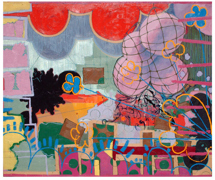
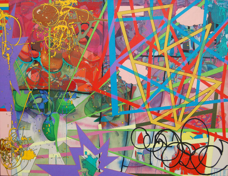
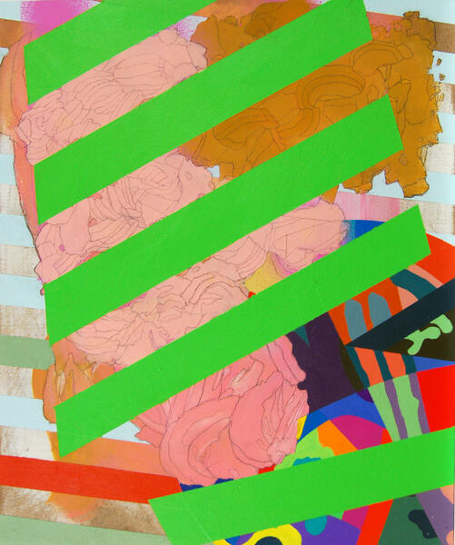
 Not Quite Equal, But Definitely Opposite, 2010eAcrylic, Collage, Spray Paint on Canvas and Paper Mounted on Panel 60"x 98"


File Folder Paintings
-
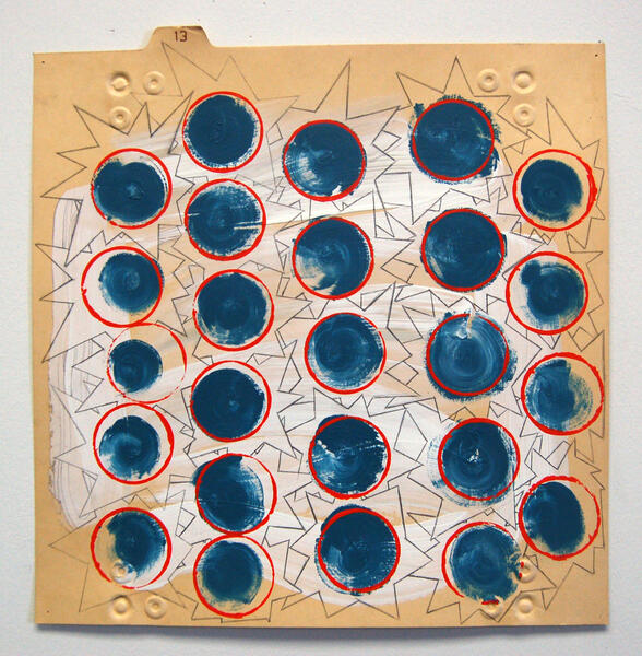
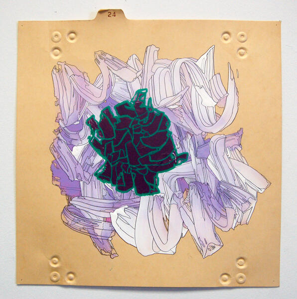 January 26, 20102010 Acrylic, Paint Pen and Graphite on Manilla File Folder 12" x 12"
 -
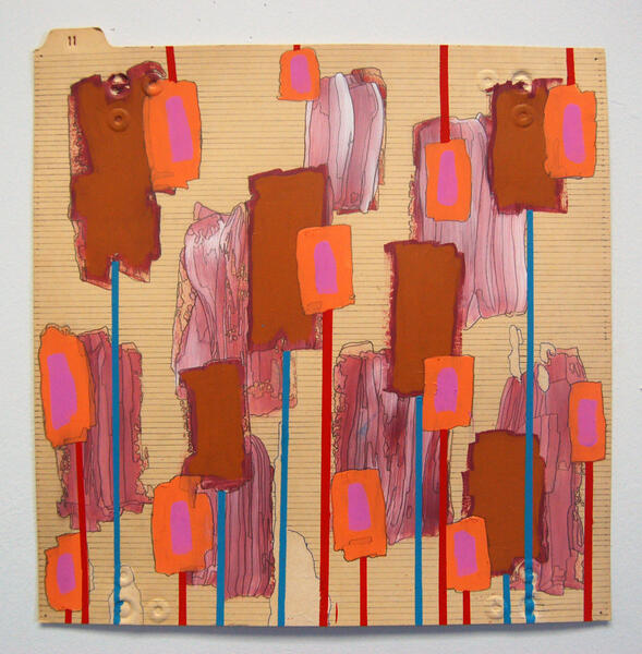
 January 23, 20102010 Acrylic, Paint Pen and Graphite on Manilla File Folder 12" x 12"
 -
 January 22, 2010Acrylic, Paint Pen, and Graphite on File Folder 12"x12" 2010
 -
 January 27, 2010Acrylic, Paint Pen, Graphite on Panel 12" x 12" 2010
 -
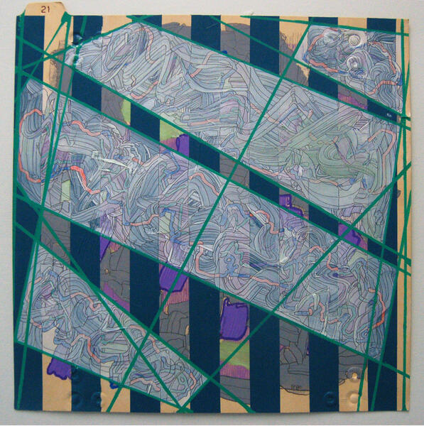
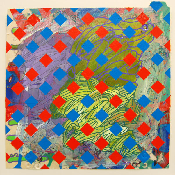
 January 9, 20102010 Spraypaint, Ink, Acrylic,Paint Pen, and Graphite on Manilla File Folder 12" x 12"
 -
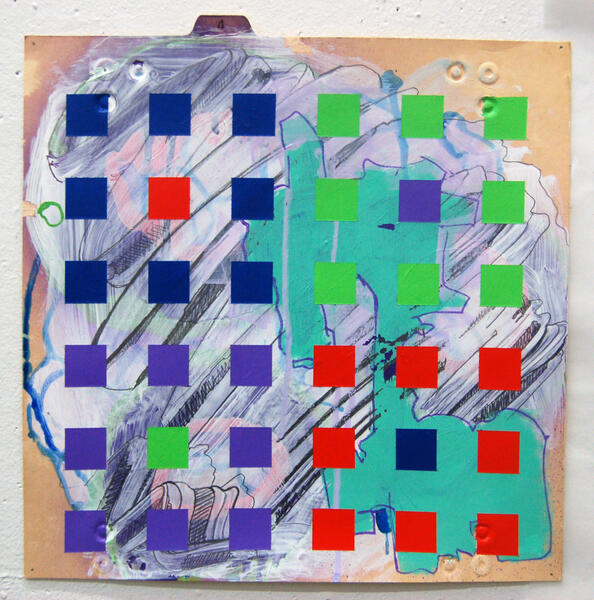
 January 29, 2010Acrylic and Graphite on Manilla File Folder 12" x 12" 2010
 -
 January 15, 20102010 Acrylic and Graphite on Manilla File Folder 12" x 12"
 -
 January 13, 20102010 Acrylic, Paint Pen, and Graphite on Manilla File Folder 12" x 12"
 -
 February 1st, 2010Acrylic, Paint Pen and Graphite on Manilla File Folder 12"x12" 2010
 -
 January 6, 20102010 Spraypaint, Ink, Acrylic Paint Pen on Manilla File Folder 12" x 12"


Small Paintings
-
 Bits and PiecesAcrylic and Graphite on Panel 14" x 12" 2013
 -
 ChasmAcrylic and Graphite on Panel 14" x 12" 2013
 -
 ObstructionAcrylic and Graphite on Panel 14" x 12" 2012
 -
 Wiped OutAcrylic and Marker on Panel 12" x 8" 2012
 -
 Mix MashAcrylic and Graphite on Panel 14" x 12" 2012
 -
 KnotAcrylic and Graphite on Panel 14" x 12" 2012-2014
 -
 FragmentedAcrylic and Graphite on Panel 14" x 12" 2014
 -
 Windows (triptych)Acrylic and Graphite on Panel 11" x 24" 2013
 -
 Mixing it UpAcrylic and Graphite on Panel 11" x 8.5" 2014
 -
 SalvagedAcrylic and Spray Paint on Panel 14" x 12" 2014


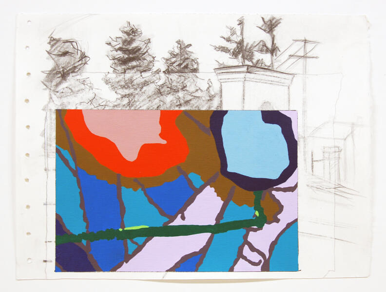
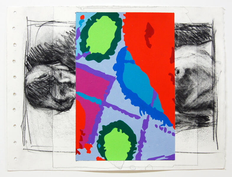
Drawings
-
 Installed at Gibbs Street Gallery at Vis Arts in Rockville, MD
 -
 dsc_0081-2.jpg
 -
 dsc_0080-2.jpg
 -
 dsc_0079.jpg
 -
 dsc_0078.jpg
 -
 dsc_0086-2.jpg
 -
 Fertile GroundA school student pets a "garden snake."
 -
 dsc_0082.jpg
 -
 dsc_0083-2.jpg
 -
 Life and Death ContrastedBackstage admirer at the Cernin Puppet Festival in the Czech Republic


Drawing/painting
-
 dsc_0107.jpg
 -
 dsc_0092.jpg“As a young girl I was raped by a group of teenage boys. They put money on the bed afterward. I was convinced it was my fault”
 -
 dsc_0003-3.jpg
 -
 dsc_0093.jpg
 -
 The Butler Delivers the GoodsThe butler, played by Julie Anderson, whose job it is to be a go-between for the Ladies and their workers, placates the gnomes with cupcakes. photo by Uli Loskot
 -
 dsc_0102.jpg
 -
 dsc_0104.jpg
 -
 dsc_0091.jpg
 -
 dsc_0103
 -
 dsc_0002.jpg


Large Paintings
-
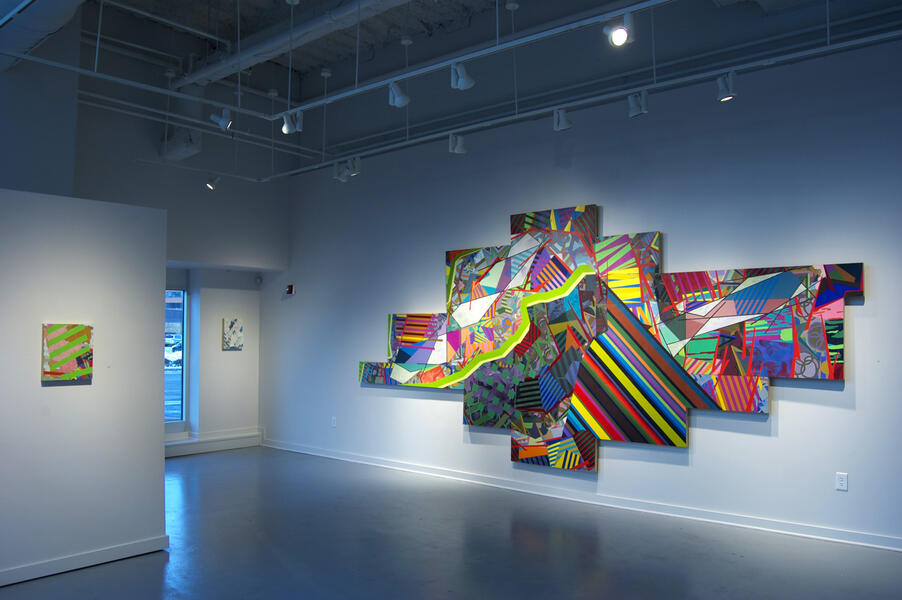 "Recycled' installed at the Gibbs Street Gallery at VisArts in Rockville, MD
 -
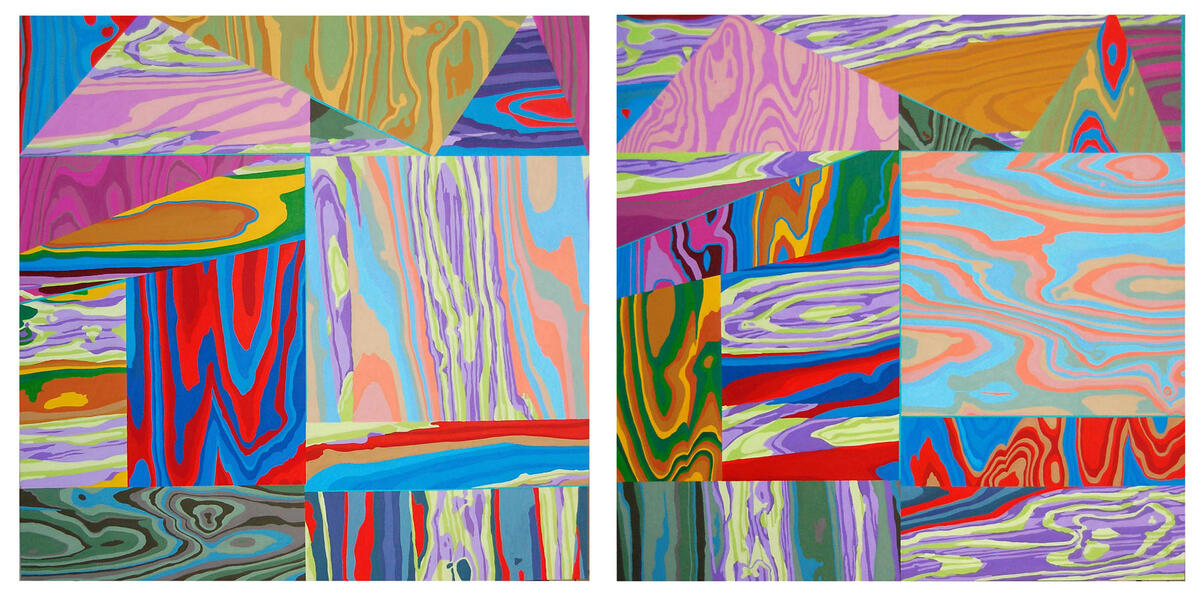
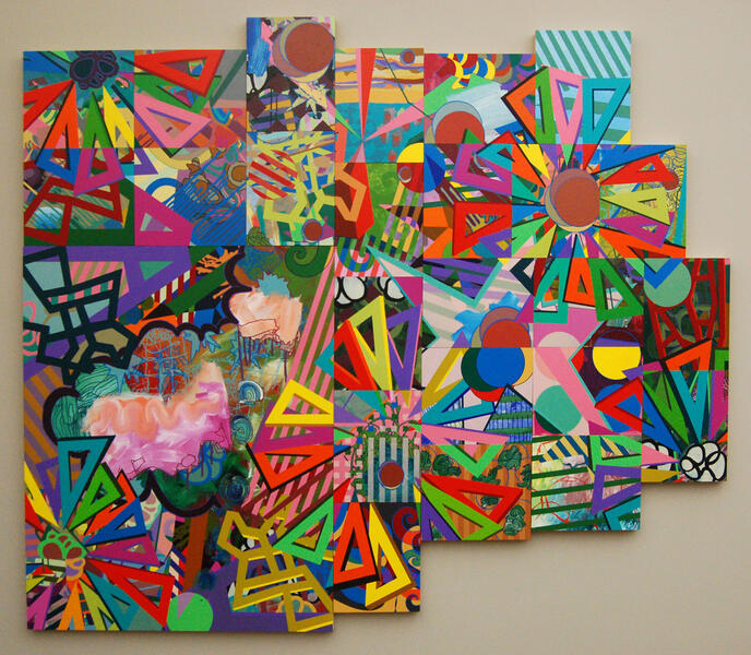
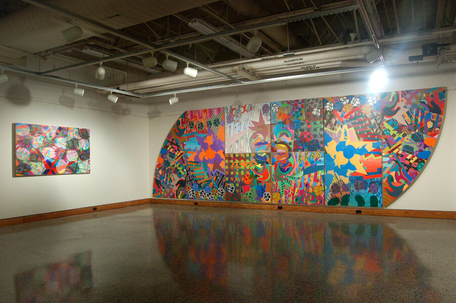 Installation view Falk Gallery, Christopher Newport University'Amalgamation' and 'The Whole is Greater Than'
 -
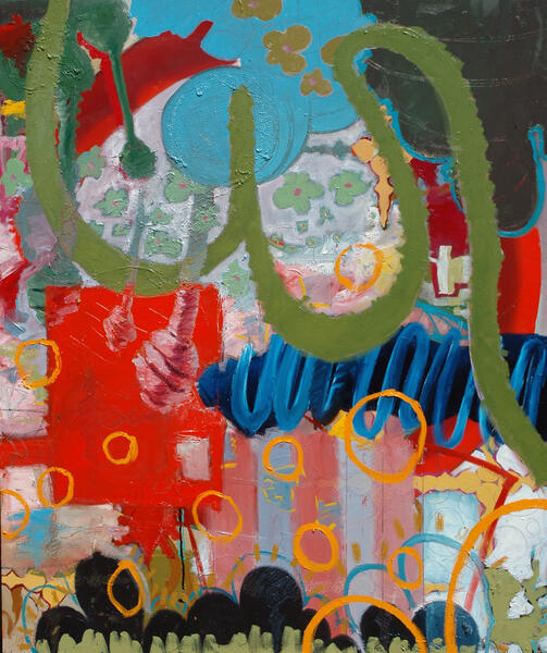
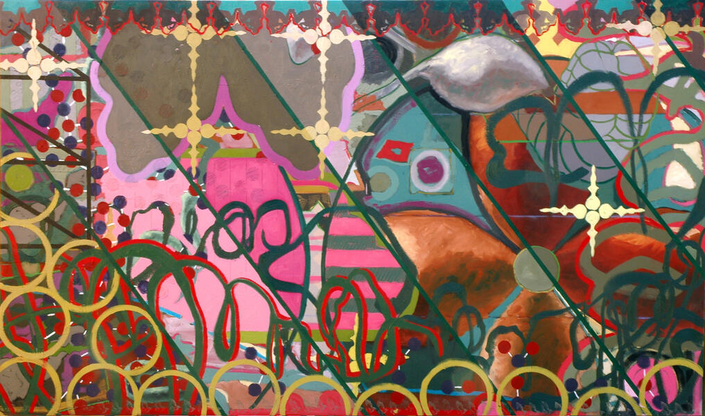
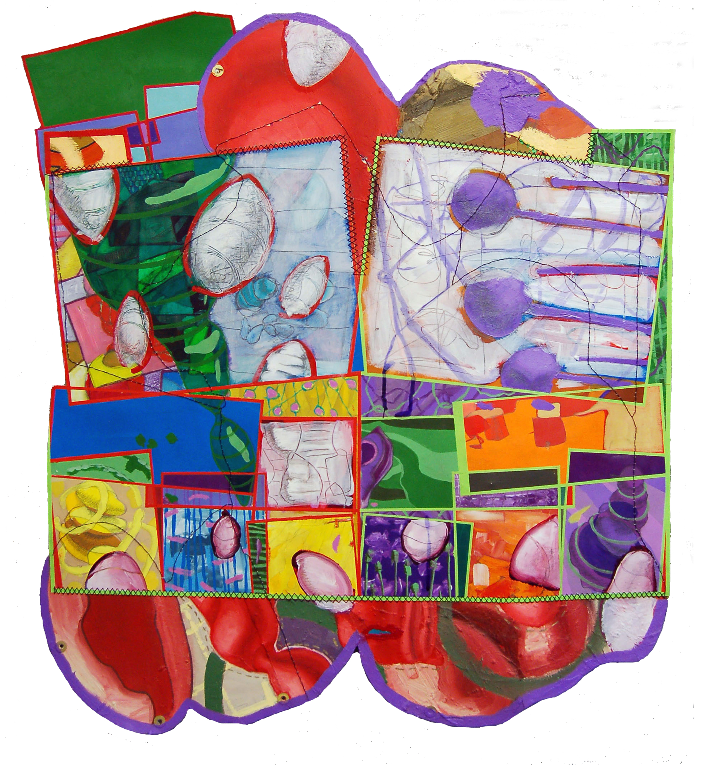
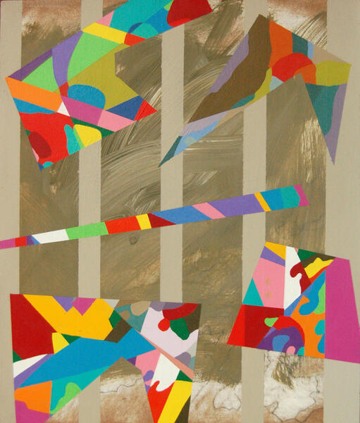
 AmalgamationAcrylic on Paper Mounted on Panel 42" x 73.5" 2010
 -
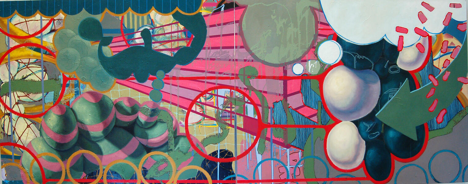
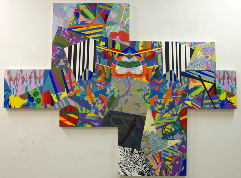
 Gaining MomentumAcrylic, Spray Paint, Pen on Panel 96" x 192" 2010
 -
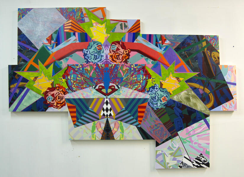
 Don Quixote's FollyAcrylic, Spray Paint, Paint Pen, Silk Screen on Panel 79" x 84" 2011
 -
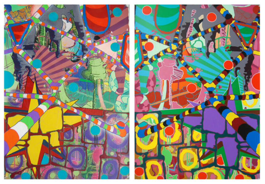
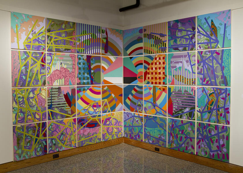
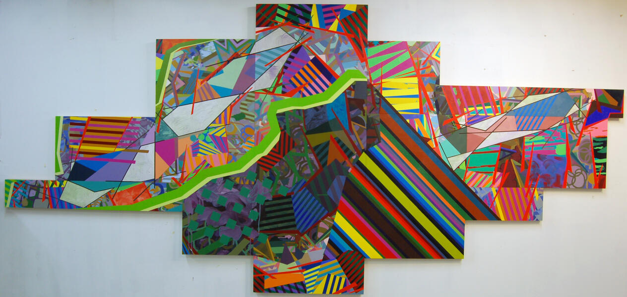
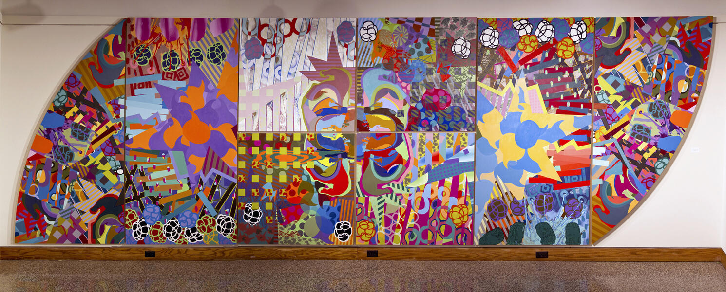 The Whole is Greater ThanAcrylic, Spray Paint, Pen, Silk Screen on Panel 96" x 293" 2011
 -
 To The BrinkAcrylic, Graphite, Marker, and Spray Paint on Paper Collaged on Panel. 41.5" x 76.75" 2014
 -
 RecycledAcrylic and Graphite on Panel 96" x 210" 2014
 -
 Everything's Fantastic!Acrylic and Marker on Panel 65" x 96" 2014
 -
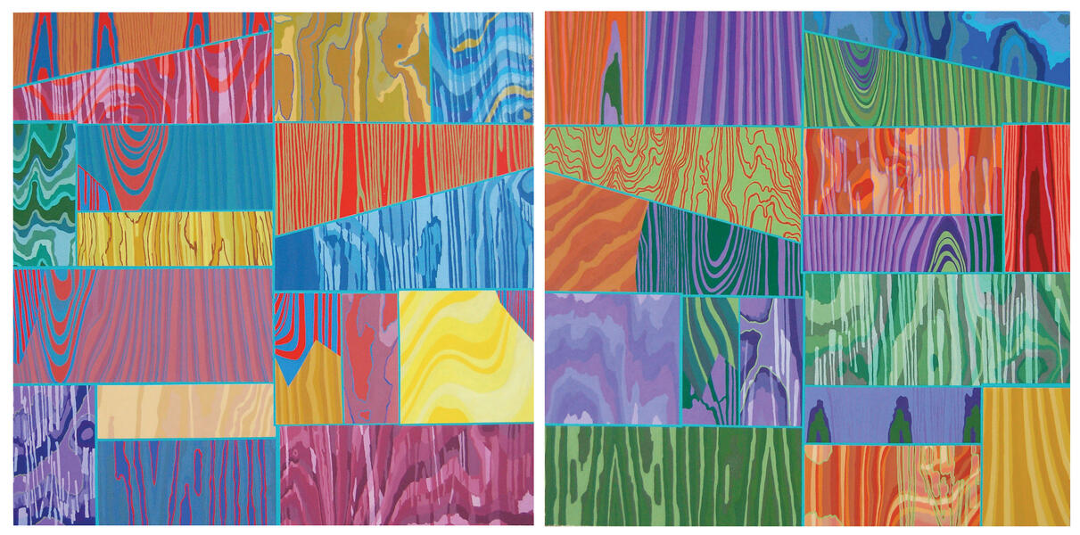
 Sifting and SortingAcrylic on Panel 72" x 96" 2015


Memory Series
-
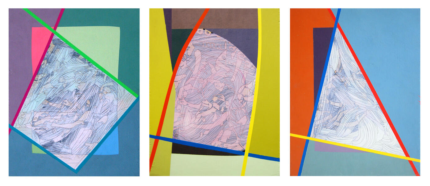
 Past Meets Present2013 Acrylic on Birch Panel 46.25" x 31.5"
 -
 Precarious2012 Acrylic on Birch Panel 48"x48"
 -
 Intermittent Lucidity2011 Acrylic on Birch Panel 45"x48"


