About J. Spence

Born and raised in Towson, studied art at Vassar and graphic design at MICA. Currently a graphic designer at The Baltimore Museum of Art.
jspenceholman.com
jspenceholman.tumblr.com
--------
I am a graphic designer, which is to say, a communicator. My job is to remove barriers to comprehension, to increase content clarity. Professionally, I keep it simple - form follows function, embellishment is excess.
However, function with no form… more
Pattern > origins/drawing
-
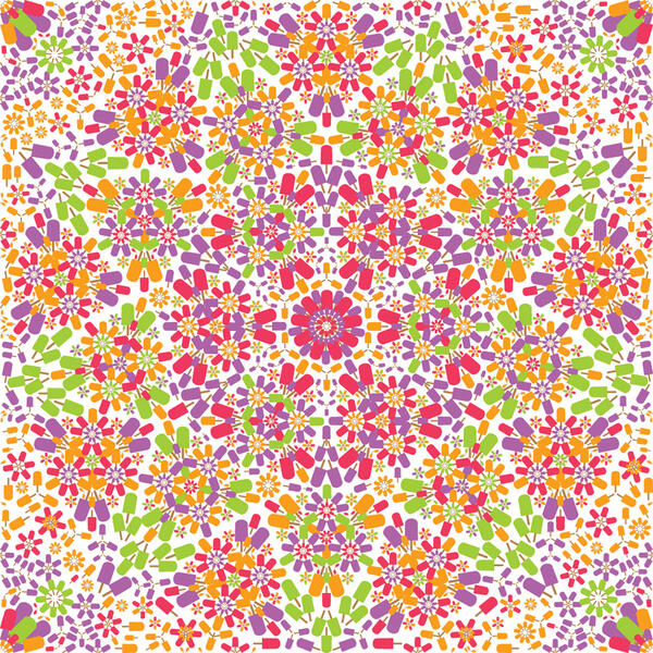
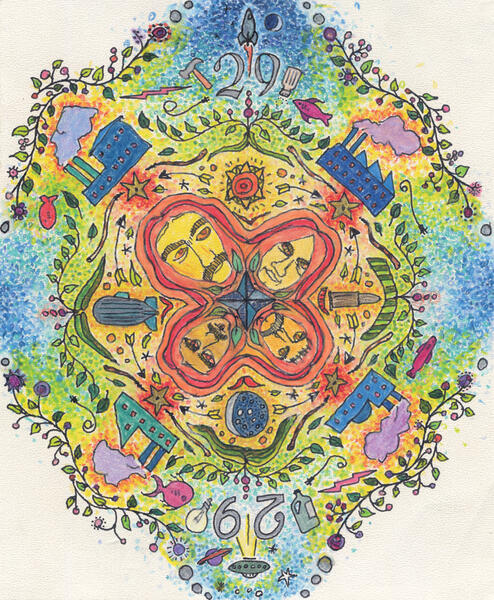 SabbathThis was an exercise in maximalism and psychedelia, by way of free association and Black Sabbath's heads. This is one of my first forays into color. Next go round I think it needs a tighter palette and more details.
 -
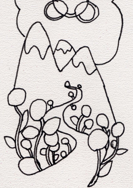 MountainsPart of a drawing that turned into a birthday card. I like the "flowers" and curve of the road. One day I think it could become an interesting sheet, perhaps.
 -
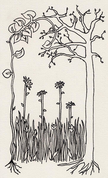 GrassAgain with the nature. I've played with the grass pattern a lot more, but still haven't found the right use.
 -
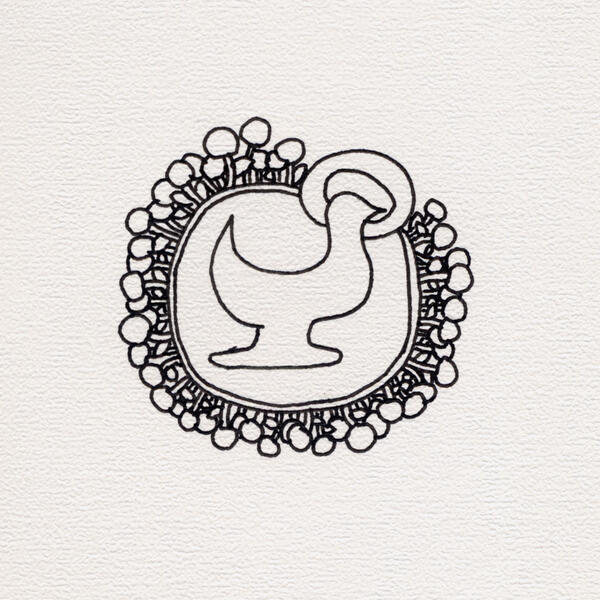 ChickenAgain, direction unknown, with organic-ish circles. I like the circle frame more than the haloed chicken.
 -
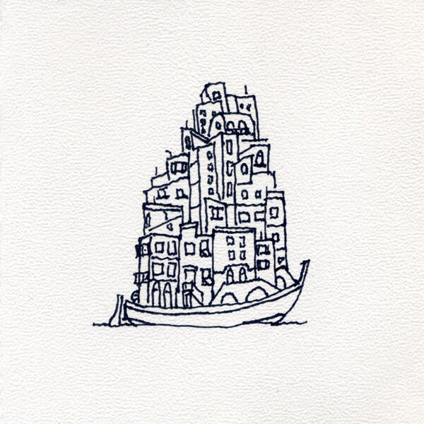 BoatWasn't sure where this was going. A river full? Other vehicles? Not sure.
 -
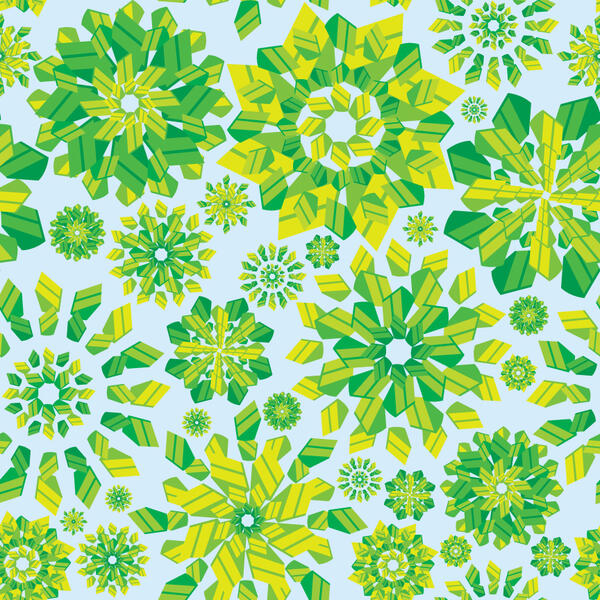
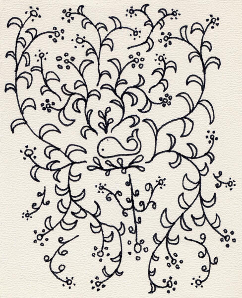 WhaleOrganic and leaf patterns are my staples.


Pattern > origins/pictures
-
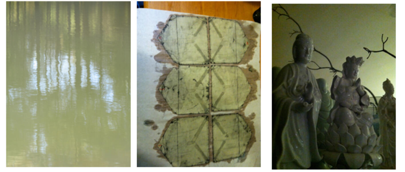
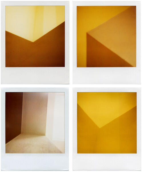 jsh-walls-polaroids.jpg
 -
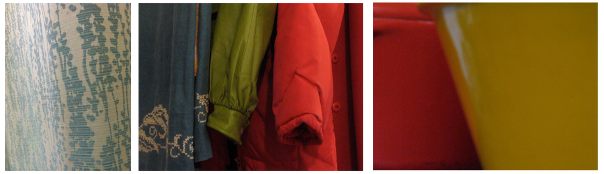
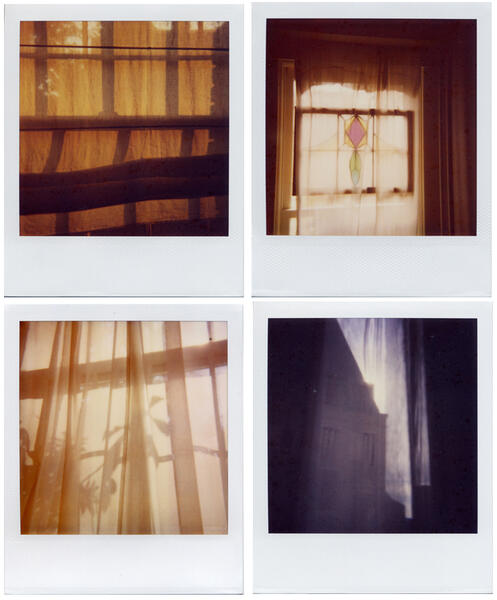 jsh-curtains-polaroids.jpg
 -
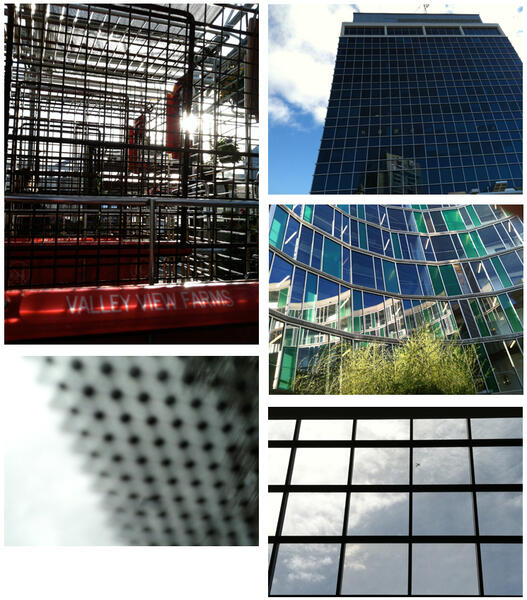 jsh-grid-phone.jpg
 -
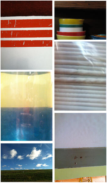 jsh-stripes-phone.jpg
 -
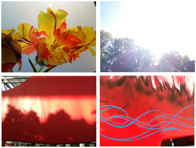 jsh-reaching-phone.jpg
 -
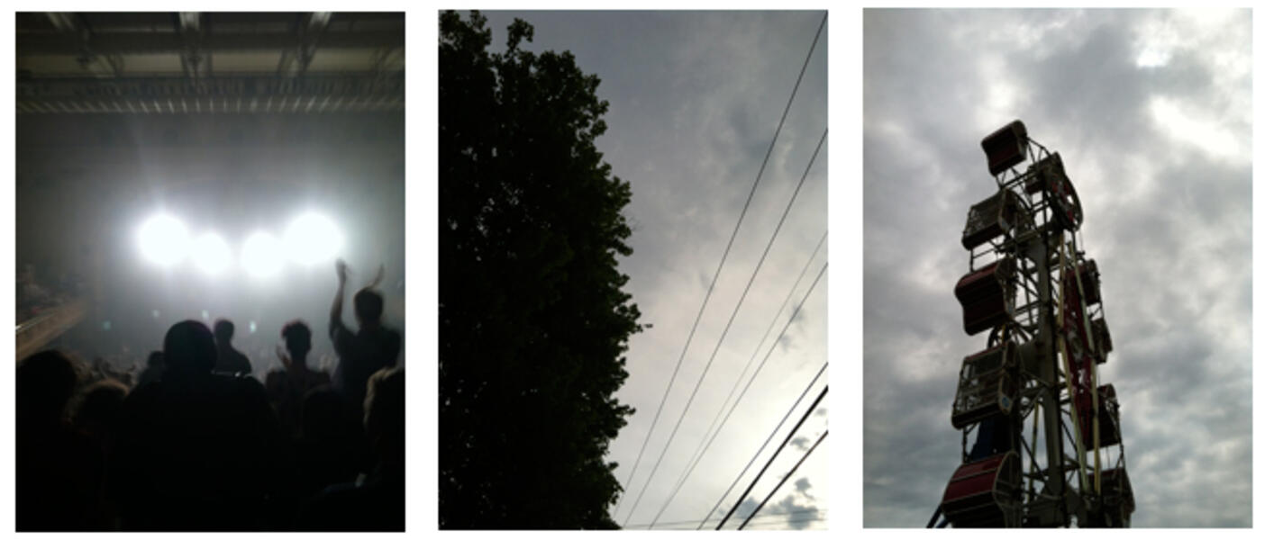 jsh-sequence4.jpg
 -
 jsh-sequence3.jpg
 -
 jsh-sequence1.jpg


Pattern > Memory
-
 Argyle bombIn high school, my friends and I were the opposite of preppy, to say the least. We had an underground newspaper that utilized the classic cartoon circle bomb in its logo.
 -
 PeeMy friends and I, in early elementary school, would pee in the back of our deep backyard instead of going inside. We had what we though was a good hiding place until the neighbor called my dad; it didn't end well.
 -
 Bungee cordIn middle school I was taking the trash to the street in our dilapidated metal cart. It was held together with bungee cords, and I managed to snap one back right into the center of my forehead, necessitating one, awkward stitch.
 -
 Green cakeWhen I turned 3 I requested and had a green Jello cake, shared with 3 friends in my backyard.
 -
 PopsicleFrom an early memory of being the dining room on a sunny afternoon, while my mom ironed and watched her soap opera, and I sat in a chair eating a popsicle.


Pattern > Mobiles
-
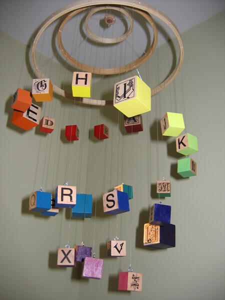
 Mobile > Alpha 1Baby view.
 -
 Mobile > Alpha 1
 -
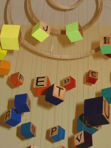 Mobile > Alpha 1First alphabet mobile, for a friend's firstborn. Concentric circles provide the hanging structure, while a spiral leads the eye through the alphabet and color progression. The letters are Helvetica on one side, decorative on the other. It is about 18x24. Hand painted, letters via acrylic photocopy transfer, fishing line for hanging, blocks are solid wood.
 -
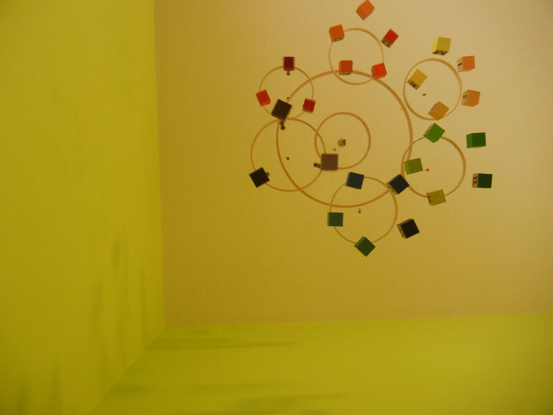 Mobile > Alpha 2Baby view.
 -
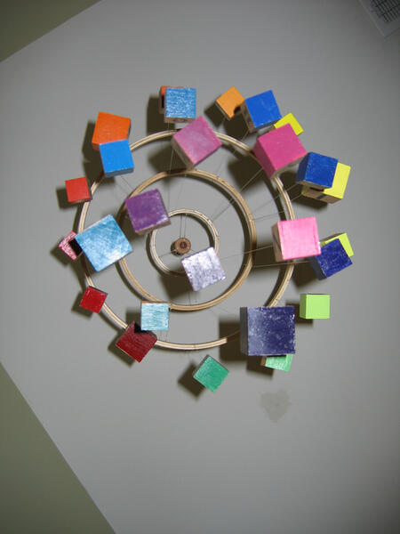
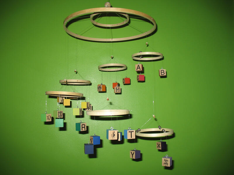 Mobile > Alpha 2
 -
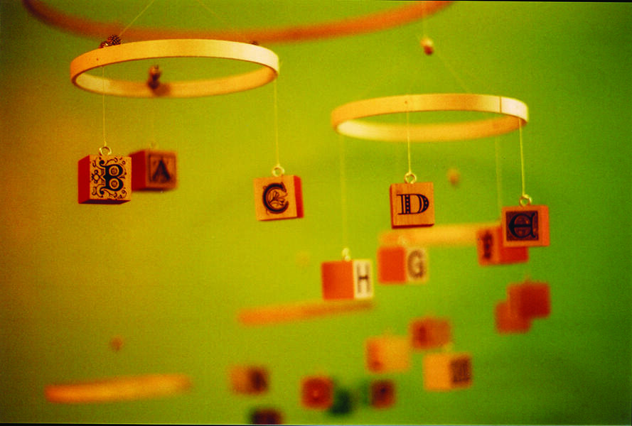 Mobile > Alpha 2Second mobile, for my home. Again, a spiral, the alphabet, and the rainbow provide structure, though in more concentrated groupings. The sections create 6 focused circular areas of movement, as opposed to the looser sway of the first mobile. The letters are Helvetica on one side, decorative on the other. It is about 24x24. Hand painted, letters via acrylic photocopy transfer, fishing line for hanging, blocks are solid wood.
 -
 Mobile > Alpha 3Baby view.
 -
 Mobile > Alpha 3
 -
 Mobile > Alpha 3
 -
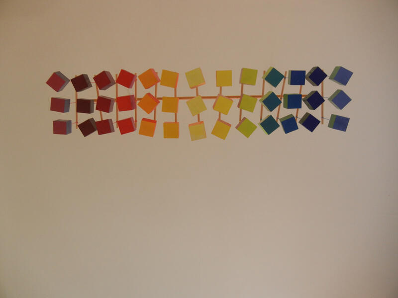
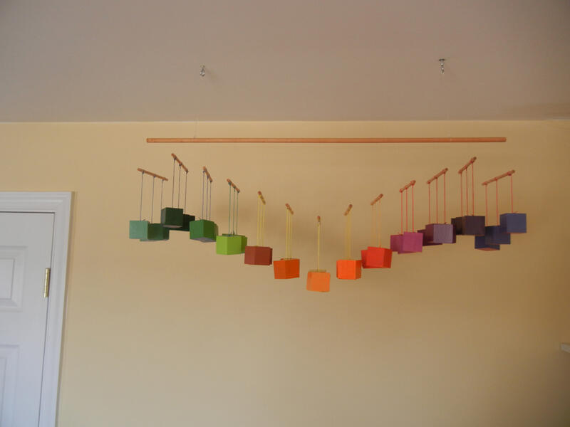
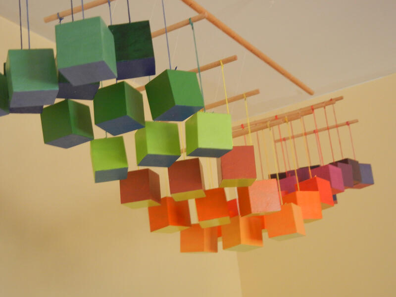
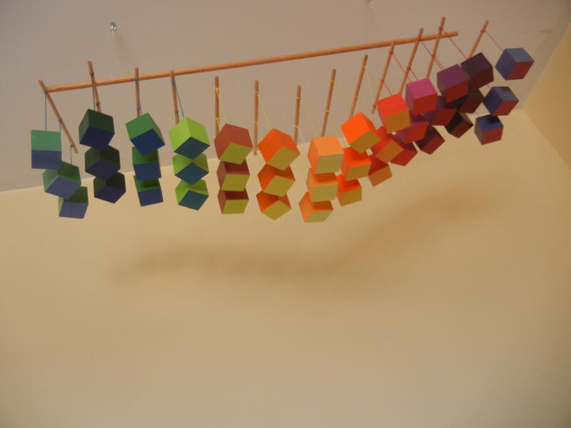 Mobile > Alpha 3Primary colors on the bottom complement the secondary palette on the sides. The hanging curve allows both color sets to be seen from multiple angles, as well as emphasizes the movement. Each row hangs independently, allowing it to sway back and forth, side to side, and twist, bending but not totally breaking the grid. It's an elastic pattern, enjoyable from any direction. It is about 7x32(ish). Hand painted, colored floss for hanging, blocks are solid wood.


Pattern > Graphic Design
-
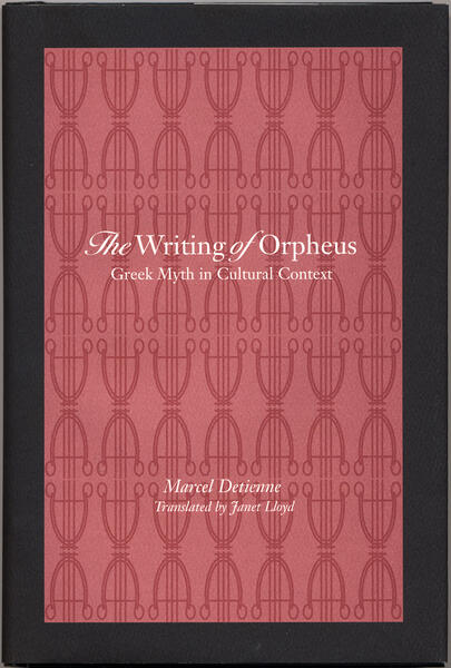 JHU Press > Detienne's "Orpheus"With only two colors and a fairly dry title, there wasn't much to work with. I introduced Orpheus' lyre, though relegated it to a simpler, wallpaper-esque background. The pattern was designed strictly decoratively, an ornament to liven up an academic piece.
 -
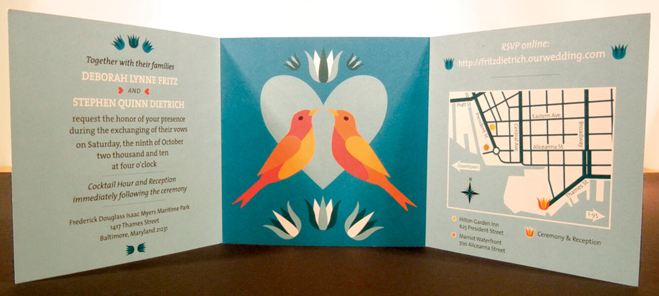 Dietrich > invitationDigitally printed.
 -
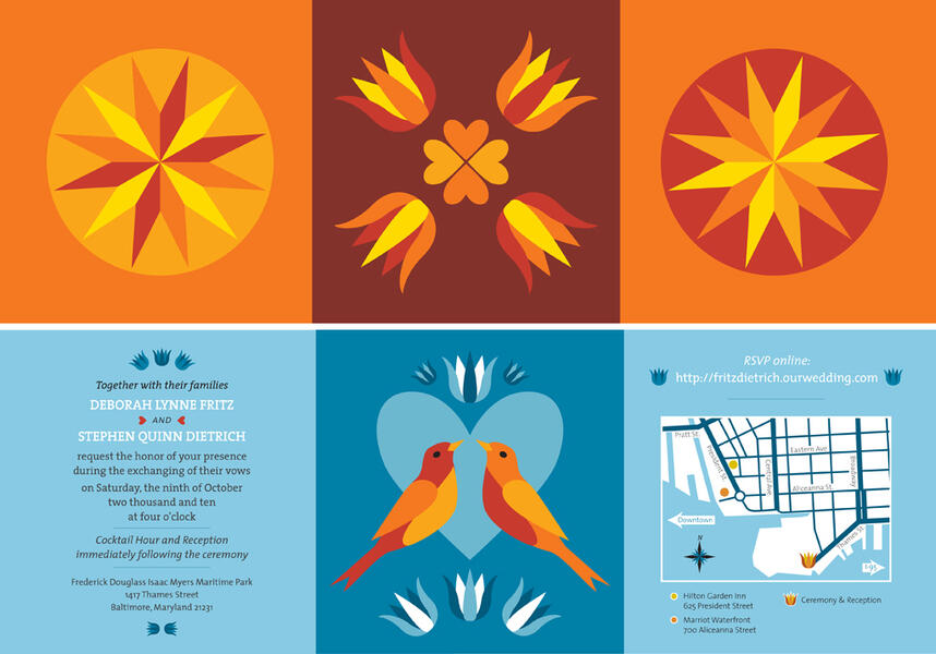 Dietrich > invitationHere I adapted patterns suggested by the couple: barn decorations of the Pennsylvania Dutch. I redrew the images in a cleaner fashion, brightened colors, and arranged the elements in a cleaner, more iconographic way. The update was more in line with their aesthetic, but kept with the aesthetic history.
 -
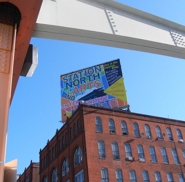 Station North > BillboardIn situ.
 -
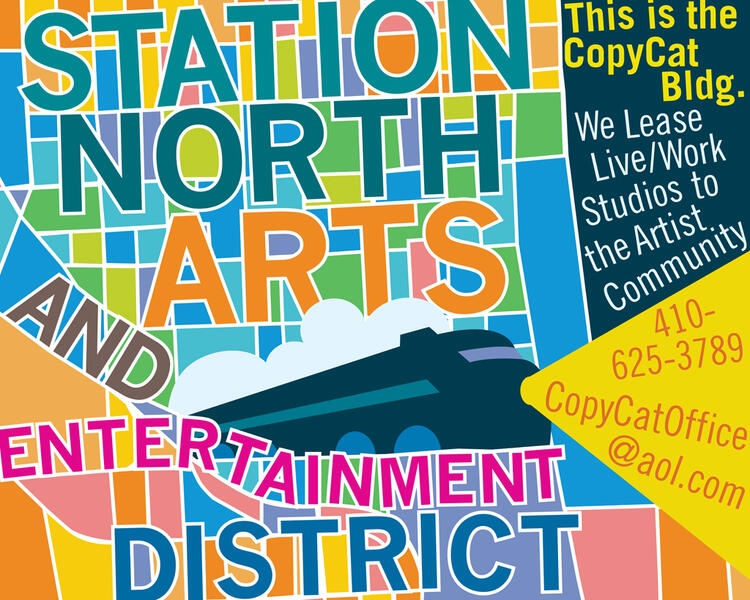 Station North > BillboardThis Station North billboard (on the Copy Cat building) was commissioned to support the arts and entertainment district. It had to relate to the area, be eye-catching, and also advertise the building itself. I started with a map of the area (an existing pattern) and revised it, adding color, reshaping blocks and redirecting streets. I wanted to refer to the original map pattern but make it fit with the text and logo, and also make it an interesting, though abstracted, pattern.
 -
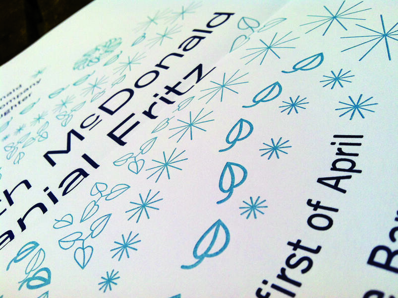 Fritz > Wedding invitationDetail of letterpress (Typecast Press, Hampden)
 -
 Fritz > Wedding invitationOutside. 16x22 folded to 8x11.
 -
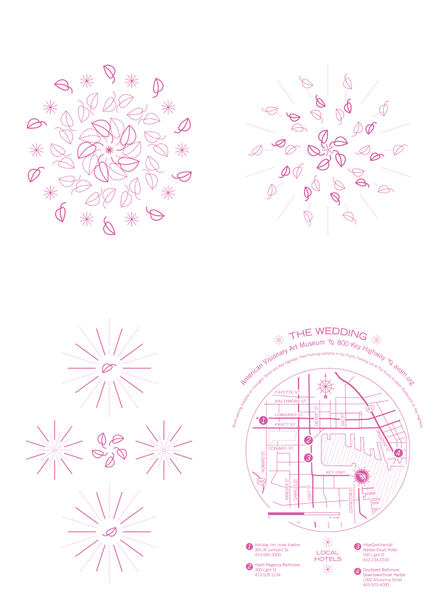
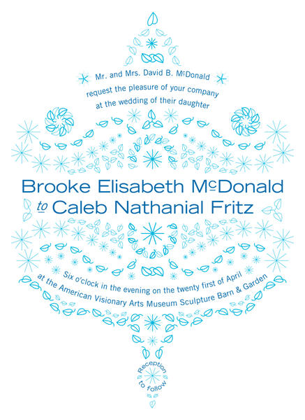 Fritz > Wedding invitationWhile this needed an element of formality, given the nature of the event, it also needed to be fun and inviting. The couple gave me images of shared and important items, including a house plant, from which came the leaf icon. The starburst refers to Fort McHenry (five points of the fort, bombs bursting in air), the location of their engagement. Only the bride and groom really knew the origin; everyone else saw a decorative pattern. The piece was 16x22, folded to 8x11 and mailed (blue on the inside).
 -
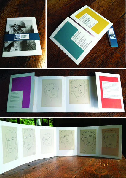 BMA > Council invitationOpening sequence.
 -
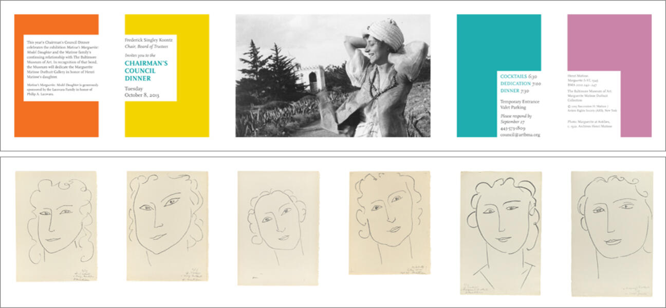 BMA > Council invitationThis invitation was developed for an event at The Baltimore Museum of Art. The exhibition involved multiple portraits of the same model, as well as some print series of the woman. I wanted to put the idea of a varying repetition up front - it drove the layout - colored blocks echo the art on the inside; opening the invitation gives the layout motion and alternate views/combinations of elements.


